A quick reminder that The Alphabet Challenge “S” Stories poll is still lagging in votes with only five days remaining. Of course, I realize we’re probably all a little occupied with a little election that’s going on.
Still, if you are a reader of our stories and someone who would like to express an opinion about which of the stories you liked the best (or disliked the least), and if you participate in the poll, thank you in advance. Links to the stories and the poll for the “Alphabet Challenge S-Stories” are HERE.<<<Link Votes will be accepted until noon on November 8th.
And . . . readers who are on a PC might have noticed something . . . a different look for the blog. But, before I discuss that, here’s a photo . . .
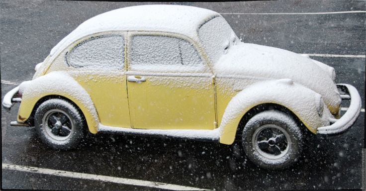
 Back in the days when we were still living in Colorado and I was still working, we’d experience our first snows in September . . .
. . . not that me working had anything to do with the snow, other than it was occasionally an arduous trip home when a blizzard would show up instead of the forecast ‘regular’ snow. As in, HERE<<link. That post has four links to other snow events (and some neat photos, in my opinion).
No, I mention work because that’s the VW Beetle of a coworker.
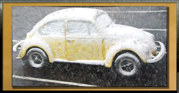
Of course, I can’t leave it at a ‘regular’ photo.
 Anyway, a new theme. I went through all the free themes and themes included with the Premium plan (which I’m in), and I narrowed it down to two themes.
If you’re reading this within a few days of publication, then the appearance of the blog is due to what is my front-runner for blog.
Edited to add: I had to nix the new theme because everything on my sidebar disappeared. VERY ANNOYED I am! The discussion below is still valid, but it won’t make sense since the theme has not yet changed.
Update: I had to rebuild the sidebar from scratch. Very Annoyed! I removed the Calendar since I don’t think anyone uses it. Likely hardly anyone but me uses any of the sidebar stuff. Regardless, the theme now appears as I want it with the exception that some of the fonts on the sidebar are a bit larger than I want, and I might change the color and/or background.
A lot of considerations went into the decision to change from my tried and true Twenty-Ten theme (which, most people probably don’t even remember because, after a while, you stop noticing stuff that doesn’t change). Well, here’s a reminder (for me as much as for the readers).
This was how the Home page looked . . .
 . . . and this is how an individual post looked . . .
 All along, I wanted a fairly ‘clean’ look with as few distractions as possible. Meaning, I wanted a mostly monochromatic theme. I figure the photos were the stars of the posts and not what the blog looked like.
Well, the theme I was using (Twenty Ten) got retired. I mean, everything still works, but as the WordPress site and underlying engine keep updating (for example, the Block Editor (ptui!)), stuff might begin to break (break as in ‘not working the way that it’s supposed to).
Here’s the thing . . . you can try any theme you want without committing to the change, and once you commit, you can always go back to your previous theme . . . except if the theme has been retired.
Understand the magnitude of this change . . . Twenty Ten is gone. I can’t go back to it.
Here’s a photo before I continue . . .

“So? Twenty Ten is gone. What’s the big deal?” you ask.
Why, you insensitive boob . . . er . . . I mean . . . let me explain. It’s not for you. It’s for me. I’ve been using the theme for ten years and seven month . . . that’s 127 months . . . or, 333,984,600 seconds. That’s a lot of seconds . . . more seconds than I have when I eat pasta, and that’s saying something.
I like consistency. Not in an OCD kind of way, but the way the blog looks has been a constant through a lot of changes in our lives.
Just to ponder a moment about the changes we’ve gone through, back in 2010, the country had no clue it would one day turn itself into an autocratic banana republic. I was in my late 50s and still playing racquetball (some of my best racquetball, I might add). Social media was used to keep touch with each other as opposed to . . . well, whatever is going on now.
The theme I’ve used for 333,984,600 seconds became a part of who I am . . . someone who doesn’t change stuff all willy-nilly for the sake of being trendy.
Here’s another photo . . .
 So, I wanted to maintain some of the simplicity and non-flashiness of the original while, at the same time, improving the the user experience.
By that, I mean the experience of the people who use a home computer and proper screen (a laptop even) as opposed to mobile devices. You see, on mobile devices, WordPress modifies the display to make it easier to read on ostensibly smaller screens. They change the font, and the format, and I have no say-so on how anything is displayed.
Of course, I see the blog more than anyone else, so I have to like it. In fact, you might say that I’m the only person I have to please because few people will notice the theme after a few visits. Me? I’ll be aware of it whenever I’m doing something on the blog . . . whatever theme I end up with has to become my friend.
Here, one more photo before I wrap it up . . .
 One last thing . . . there are two ways to customize a theme. What you see is what the ‘customize’ interface in the Admin Page can affect. I tried making most everything gray or black, but I notice sometimes the colors don’t ‘stick’.
The other way is to edit the CSS code of the theme, and change stuff at the root level. I know a tiny bit about CSS and I’ll have to learn a bit more because I want to further tweak this theme before I try a different one.
So, for them — like me — who like consistency and the familiar, we’ll get there . . . but on the way you might see stuff change, change back, and, occasionally, be completely redesigned. Hang in there; it’ll all settle in due time.
Here’s the gallery of the above photos (including Twenty Ten) . . .
Stay safe out there . . . tomorrow is likely to be a crazy day.
That’s it. This post has ended . . . except for the stuff below.
<><><><><><><><o><><><><><><><><><o><><><><><><><>
Note: if you are not reading this blog post at DisperserTracks.com, know that it’s copied without permission, and likely is being used by someone with nefarious intentions, like attracting you to a malware-infested website. Could be they also torture small mammals.
<><><><><><><><o><><><><><><><><><o><><><><><><><>
If you’re new to this blog, it might be a good idea to read the FAQ page. If you’re considering subscribing to this blog, it’s definitively a good idea to read both the About page and the FAQ page.


Nice photo of GOTG!
LikeLike
Thanks, and here are a few more . . .
https://dispersertracks.com/2013/05/02/garden-of-the-gods/
Still deciding if this is the theme I’ll go with . . . but so far, so good.
LikeLike
And I didn’t get a ping that you’d replied, so there’s something going on with that. Looked at your other GOTG photos and they’re all lovely. I did that in the WP app Reader on my Android phone since I was away from the computer yesterday (to maintain my sanity), and there’s some oddities with the last gallery-the text below appears on top of the images. If you want a screenshot just let me know.
LikeLike
No need, I’ve noticed some additional oddities with images. On some posts they overlap, and in other posts, groups of images (not in a gallery) are shown in different sizes.
Annoying, but I’m looking at other themes since I don’t want to go back and edit 2,000+ posts to make sure they show correctly.
LikeLiked by 1 person
By the way, I just realized . . . are you referring to the SmugMug gallery? I’m asking because that post doesn’t have a Wp gallery.
And, yes, the SmugMug Gallery has some writing (which I’m trying to find a way to get removed); one is “View Info” which is a link to information about the photo you’re viewing, and the other is “Buy Photo” which is a shopping cart option for anyone wanting to buy the photos (no one ever does, but then, they’re not set up for commerce since they have my watermark on them).
LikeLike
Hi, no. I meant the gallery of images at the end of this post, when viewing it in the WPcom Reader on the Android app.
LikeLike
How about with this theme?
LikeLike
No change, but I think this has more to do with the Reader cache of your post since themes aren’t reflected in the RSS feed of your site.
LikeLike
I preferred the previous and next posts noted at the top of the open post, which this theme does not have until you reach the end and comments. I also have an easier time reading on white background as opposed to the gray (even harder when the copy is blue). But, these are my preferences, and as you noted, you’ll be testing themes until you find the right one for you.
And yes, the colorful photos do seem 3D in all the sea of gray! Love ’em!
LikeLike
Yup, I miss that too.
Not sure what you mean about a gray background vs. white. The background behind the width of the post is set to gray, but that’s only visible if you make the window larger than the post (the old background was black). The background of the text itself (in the area where I write) is white (or, is white on my screen).
If you mean the sidebar, people shouldn’t be reading that more than once. Also, if you make the window small enough, the sidebar disappears (and should go down to the bottom in some instances).
The reason for the gray theme was to highlight just the post (everything else is static and is always there).
One other things that bothers me is that the comments do not indent with replies, so you don’t know who’s answering to whom (a common problem on some blogs I follow).
All that said, I’ll be looking to edit the components because I want a lighter gray for the sidebar and the to change the combination on the header (I went with a dark wolf because the lettering is white and doesn’t show up with my regular light-gray and white logo).
As I said, a work in progress.
BUT . . . I like the font combination either with or without serif. Also, I went back to some older posts (with lots of photos) and, to me, it seems as if the photos “look” better. It could be the gray sidebar but I also think they are a bit larger than my old theme. I’ll have to check.
LikeLiked by 1 person
Odd, this one indented, but my response to JenT did not indent. WordPress be weird.
LikeLiked by 1 person
So, yes, the new theme has a wider display area, and hence why older posts have the photos not be as wide as the text:
https://dispersertracks.com/2012/01/01/2011-the-year-in-pictures/
I’ll have to do a post specifically testing that.
But, still, as in that post, the photos (again, to me) seem ‘better’ as in making more of an impact.
Also, the font in that post (as most of my posts) is in blue. I’m still trying to decide on what I’ll settle on as far as text colors.
LikeLiked by 1 person
Love the VW Beetle, both versions! The forced changes to WP are bothersome to say the least, and time-consuming, so reading your trials and tribulations is most helpful towards trying to get a feel for my own direction, and a way to get away from the draw-out and aggravating election coverage. M 😦
LikeLike
Trials and tribulations is right. A lot of the themes are geared toward glitz as opposed to utility and just presenting the content. Many mess up previous posts, and many are difficult to read.
As for the election, I’m not reading the news. I figure in a week or two (or ten) it’ll all resolved itself with or without me watching it.
As the old saying goes, a watched election never ends.
I suppose it will be interesting learning which liar and which of the two corrupt parties prevail.
I know the people are the losers, but they brought this on to themselves by their unwillingness to recognize each other as fundamentally wanting the same thing . . . To have a functioning government with elected officials more interested in serving the country than accumulating personal wealth and power.
LikeLike
By the way, they lied . . . It looks like I can revert back to the old theme, so, unless I resolved these issues, it’ll be back to the good old Twenty Ten.
LikeLike
Love the VW Beetle…a LOT!
All the photos here are beautiful and very artistic!
Fun to try out new themes.
(((HUGS)))
LikeLike
Thank you, Carolyn. It looks like the VW has a coating of powdered sugar on it, which makes it look delicious . . . If it were a cake.
However, I have to differ on trying themes. It’s a pain try trying to find something that works like you want it to. This one still has issues.
LikeLiked by 1 person
The VW looks exactly like that! 🙂
LikeLiked by 1 person