A few of my readers like B&W photos. A few like Color photos. A few like both color and b&w renditions of photos. I done used to put everything in one post, but the eyes can play tricks when you see a color photo immediately followed by a b&w photo or vice versa.
Well, here will twelve B&W renditions land. I added these photos to the Laupahoehoe SmugMug album. You can also click on the photos and a larger version will open up in a new tab or window.
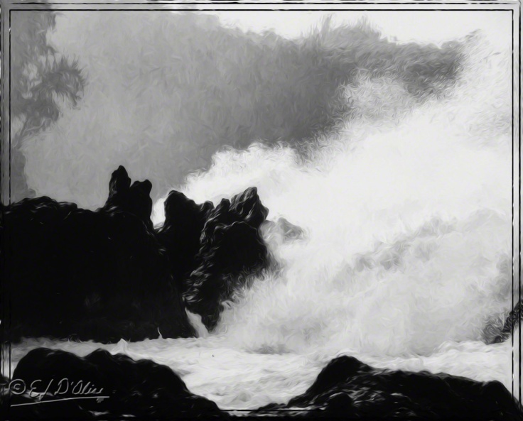
Of course, I’m playing with more than just the B&W conversion. I’m dabbling into the Impressions 2 Topaz plugin as an added diversion.
For some of these, you will need to look at the larger versions. Meaning, most of you will not see the details of the conversion. It’s OK . . . in the overall scheme of things, it’s a minor loss to all involved.
There are a number of canned conversions I’ve saved through the years that I’ve been processing photos. That means that at most, only a few will sport the same conversion. Diversity is my name.
The above is another one I also did in Impressions 2. Again, you need to look at the larger version to see the details.
My original intent was to do a poll asking which conversion is preferred over others . . . then it occurred to me that perhaps people are tired of voting.
This next one is a pretty good one in my book. Well, if I had a book, and if it was mine.
Some of the B&W conversion give the opportunity to leave a bit of color in there, like a slight cast . . .
When done nice, it’s hardly noticeable, but it does register. The Glow 2 plugin brings out the cast, making it very evident. 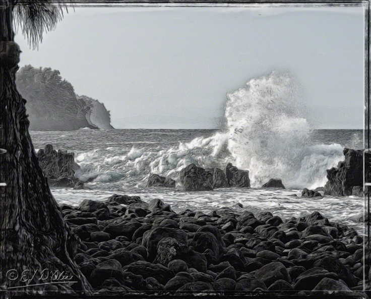
Also, find the monkey in the photo. Wait; maybe it’s a bird.
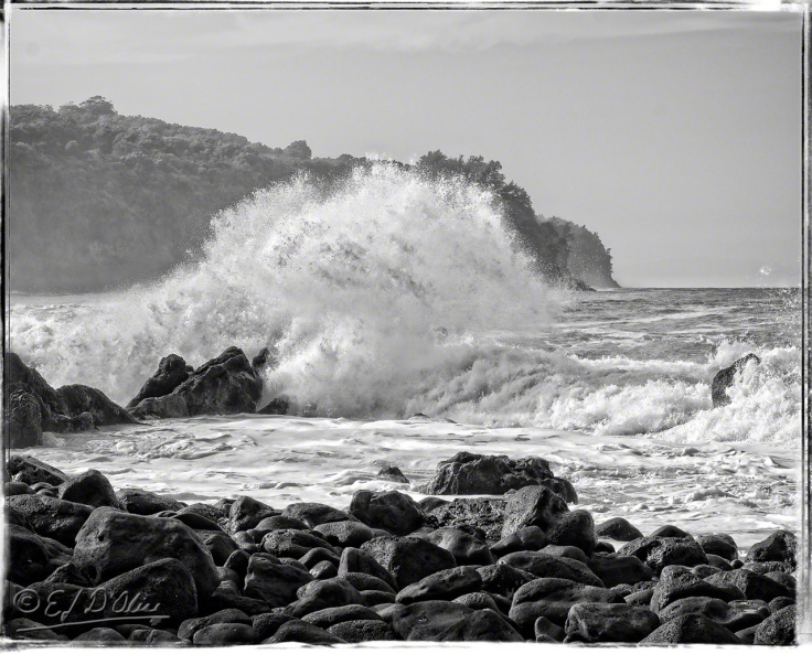
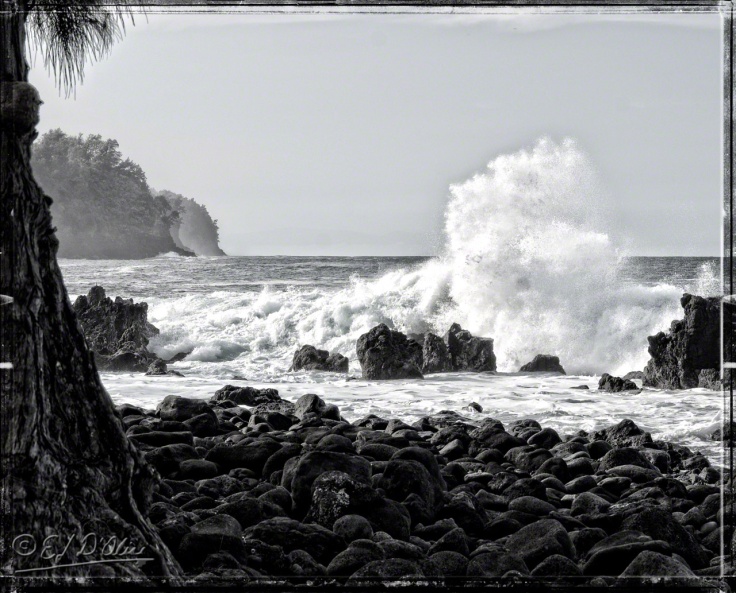
There is something about converting photos with lava into B&W photos with lava. I like the end result.
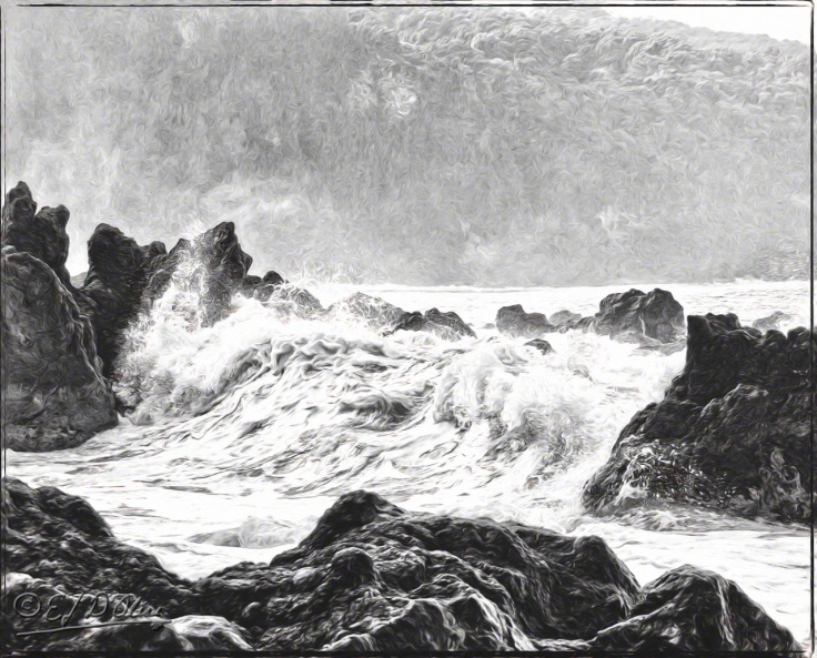
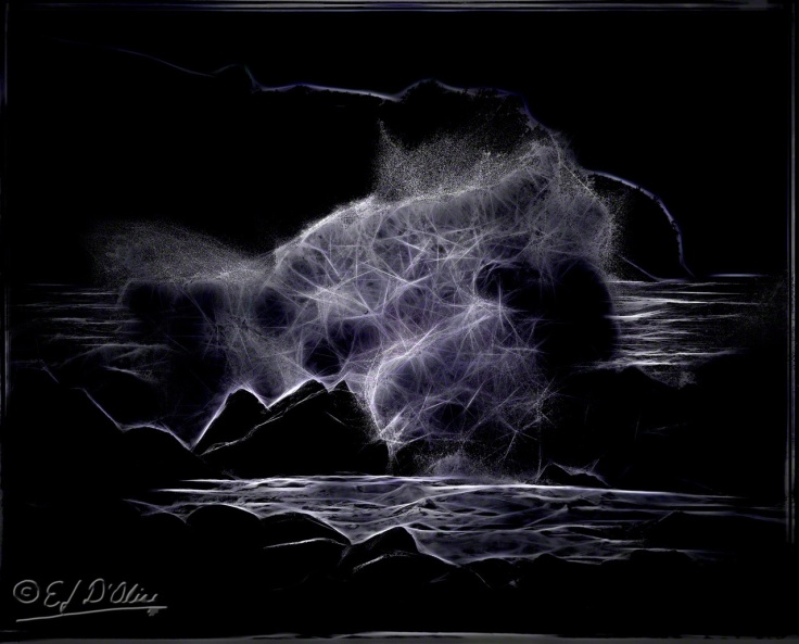
Glow 2 can give interesting abstract patterns. I did not play around with this too much because my shoulder hurts and sitting at the desk is a bother. Still, I give you . . . Electric Surf.
Now, three types of conversions and we’ll call it a night. Got me some Harry Dresden books to read (yup, still not writing).
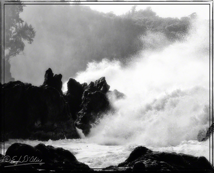
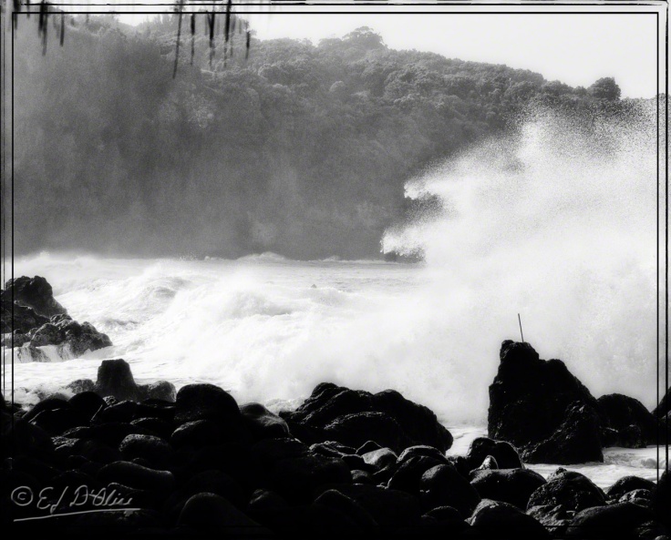
For the above photo, I pushed what I call “drama”.
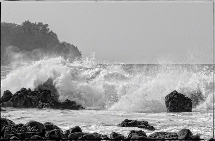
For this next photo, I pushed the “glow.”
If you do look at the larger version, see if you can see the face leading the charge.
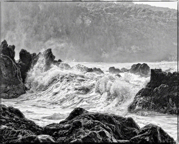
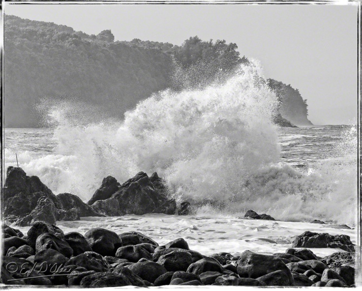
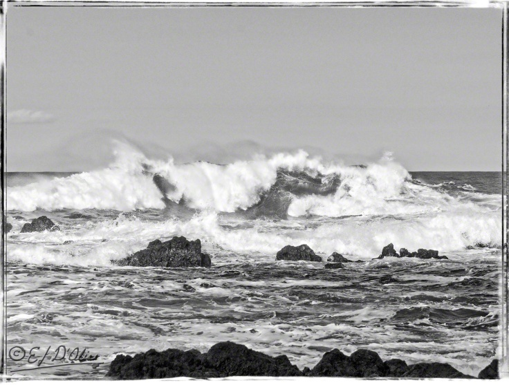
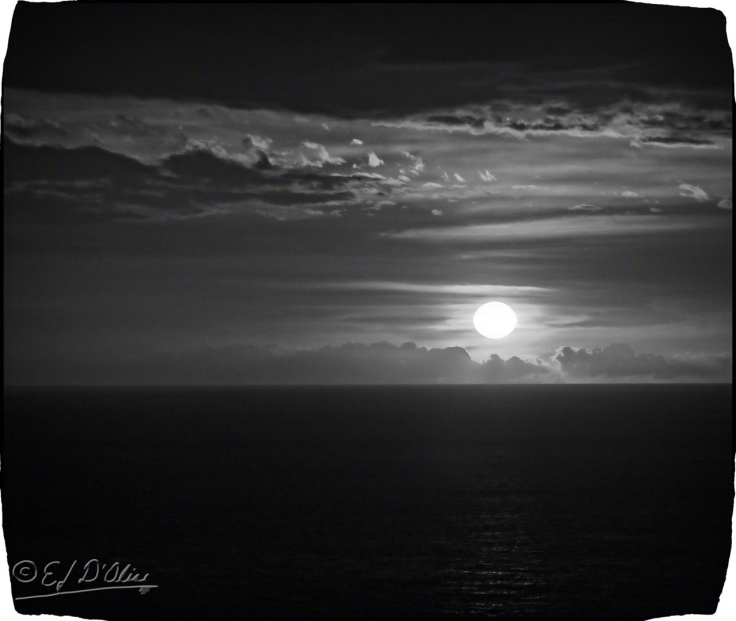
Finally, a pretty straight-forward conversion.
Most people present their B&W work one photo at the time. I admit that gives each photo a chance to shine on its own. Presenting multiple versions is usually invites comparisons and deciding which is superior.
It need not be so . . . it’s why I link to the SmugMug gallery. Also why I offer up larger versions when you click on the photos. Each photo should be considered on its own.
I like all of these for different reasons. The content, the sharpness, the glow, the contrast, the dynamic range, or a combination of some or all of those attributes.
. . . plus stuff that I can’t even explain other than something about each one reaches for a part of me that resides just below my awareness and makes up the totality of what I consider aesthetically pleasing. Is there one I like the best? Not really.
Not surprising that since I processed each one until I was satisfied with how each looked. Someone not me might find one or more they like above the others.
That’s also not surprising since they probably would have processed these differently, satisfying their own aesthetic standards. Some of our preference might overlap for some of the photos, but probably not all, hence preferring one or two above the others.
Stay safe, stay strong.
That’s it. This post has ended . . . except for the stuff below.
<><><><><><><><o><><><><><><><><><o><><><><><><><>
Note: if you are not reading this blog post at DisperserTracks.com, know that it has been copied without permission, and likely is being used by someone with nefarious intention, like attracting you to a malware-infested website. Could be they also torture small mammals.
<><><><><><><><o><><><><><><><><><o><><><><><><><>
Please, if you are considering bestowing me recognition beyond commenting below, refrain from doing so. I will decline blogger-to-blogger awards. I appreciate the intent behind it, but I prefer a comment thanking me for turning you away from a life of crime, religion, or making you a better person in some other way. That would mean something to me.
If you wish to know more, please read below.
About awards: Blogger Awards
About “likes”: Of “Likes”, Subscriptions, and Stuff
Note: to those who may click on “like”, or rate the post; if you do not hear from me, know that I am sincerely appreciative, and I thank you for noticing what I do.
. . . my FP ward . . . chieken shit.
Finally, if you interpret anything on this blog as me asking or wanting pity, encouragement, or advice to better my life, know my subtle mix of irony, sarcasm, and humor is blowing right by you.
I admit that I do love the colored pictures you post, especiall the wildlife and flowers.
But I have to admit that those pictures are extremely powerful in black and white.
LikeLike
Thank you. Some subjects are more suited than others for b&w treatments, and waves seen better than most at showing well both in color and b&w.
LikeLike
Be nice to see some gently rolling waves for a change; but then that’s just me
LikeLike
LikeLike
You are so talented, both as a writer and as a photographer… Great photographs: there is something older, essential when it comes to black and white pics… Wishing you well, dear Disperser. 😀
LikeLike
Well, crap! . . . now, I’ll have to look up how to blush and look all humble and stuff.
Seriously, thank you, and yes, there are occasions when B&W suits the subject well.
LikeLiked by 1 person
. . . and, thank you for the wishes. Sending you some by return comment.
LikeLiked by 1 person
Incredible shots, all with their own drama. I particularly like the featured picture on the last two posts where the one in colour would make a magnificent painting, but the one without is perhaps more striking.
LikeLike
I don’t know which photos are featured (I presume you mean in the Reader). There are no duplicates between the posts, but the color version of the first one in this post is similar to the color version of one in an earlier post (snapped a few seconds apart), and yes, I like how that came out both in color and B&W.
LikeLike
Yes, I mean the first pictures — not counting the map. You had me fooled with those; only now that I examine each in more detail can I see that they have a number of subtle differences. Amazing how similar the left hand part of the wave is in both, even though the other end differs.
LikeLiked by 1 person
I like all your B&W photos! These are great! The waves appear stronger in B&W… more action going on. I like clicking on the photos and seeing things close up.
I love when you have us vote!
Hope your shoulder feels better by now.
(((HUGS)))
LikeLike
Thank you. I was pleased with how these turned out.
As for voting, I’m lacking the creative humor to do polls like I usually do. It’s like a pall has descended on the world and everyone is holding their breath, fearing a big fart is coming . . . and hoping it’s just gas.
LikeLiked by 1 person
Great description!
LikeLiked by 1 person
Perfect setting for B&W. Particularly love the waves in the first pic.
LikeLike
Thank you, PT.
LikeLike
Awesome black and whites Emilio! 🙂
LikeLike
Thank you, Norma.
LikeLiked by 1 person