I’ve not started editing my NaNoWriMo No. 3 (a. k. a. NNWM-2K15) because I’ve been busy with other stuff and because I’m still letting it simmer.
I have, however, been sending out a few things. So far, I’ve had three rejections for my short stories. Two from Asimov’s Science Fiction and one from Clarkesworld Magazine. I’ve not yet heard from Analog SF/SF and Tor. Of the fifteen agents I queried with my 2014 NNWM, ten have either declined or their stated maximum response time has lapsed by multiple weeks, and hence can be considered as not interested.
None of the rejections were of a personal nature. For them who don’t know, I’ve worked out there are three types of rejections.
- The “how dare you even contact us” is characterized by a lack of response. When you submit, you’re often informed that “if you don’t hear from us in X-number of weeks, you can assume we thought your stuff was crap and we are amazed you had the audacity to query it”. The ‘X’ varies from four weeks to as long as six months.
- The “form letter rejection” is self-explanatory and falls into two camps. The first I call the “it’s not you, it’s us” camp and says something like “thanks for wasting our time with stuff we don’t need at this time”. To their credit, the wording is a little more polite that that, but I know what they mean. The second I call the “it could possibly be you” camp and it says something along the lines of “we did not connect with your submission, and by the way, here are some helpful links about the craft of writing”. I don’t know . . . I assume they are trying to be nice, but it still sounds a lot like “wow, we’ve not seen drek like this since grade school, and speaking of which, perhaps you should consider going back to one”, you know, suggesting I should go to a trade school. Into welding, perhaps.
- The “oh, so close; keep trying” takes the form of a more personalized letter explaining in detail what they hated about your story. From reading the oracle that is the Internet, I gather this is the desirable form of rejection. Apparently people like reading that what they thought was their best work is not quite there yet. I guess I’ll see how I feel if I ever get one of these.
Now, I get that everyone is pretty busy these days, what with Twitter, Facebook, Pinterest, Instagram, and all them other wonderful tools designed to improve one’s efficiency and productivity.
Still, it would be nice if agents and editors would have different types of form letters they sent out. That’s what I would do in their place. I’d have X-number of pre-formatted letters where ‘X’ is ten.
So, for instance, Number 6 might be something like:
Thank you for sending us your hard work. We understand you put your soul into this (unless you’re Disperser; he’s soulless), and it was not bad. However, your story did not sufficiently distinguish itself from the other submissions we received. We want you to know there’s nothing wrong with your writing, and it’s maybe a cut above the rest, but you need to be more creative with the characters and/or story ideas. Thank you for the opportunity to see your work.
That lets the writer know they have what it takes as far as writing, but need to work on the story content.
On the other hand, Number 4 might read something like this:
Thank you for sending us your hard work. We understand you put your soul into this (unless you’re Disperser; he’s soulless), and it was not bad. However, while this was a unique and interesting concept that held our interest, the writing itself is not up to publishing quality. Were we a charitable organization, or if this were the 1950s, we would work with you to clean up this mess and get it publishable. Unfortunately, it’s 2016, and there are literally tens of thousands of writers who are farther along in their craft than you are, so we have no incentive or interest in nurturing whatever talent you might have. Thank you for the opportunity to see your work.
Just to bookend this thought exercise, Number 1 might read something like:
Holy crap on virtual paper! Are you Disperser, by any chance? We ask because this has no soul, and we understand he’s soulless. Seriously, dude! What were you thinking? Did Fred in Marketing put you up to this? You tell Fred I’m going to get him for this! See what you did? I’m using exclamations point! AARRGH!
Number 1o might read something like:
This was a joy to read. The characters had our hearts swell with our love for them, and the plot was like a gentle breeze filling the sails of our souls. We’ve not seen anything like this and doubt we will see the like again in our lifetime. We would like to offer . . . Wait . . . You’re that soulless dude, Disperser, ain’t you? Never mind.
Anyway, I’ll keep submitting. From what I understand, perseverance often counts more than talent. I guess the whole point of the exercise is to keep submitting stuff until you break their will to live. I can do that.
##
Cruisers Update X – The Details Part I
Continuing with my late reporting of the June 14, 2015, Tri-Lakes Vintage Car show.
After I got done photographing nearly each car at the show (I ignored the more modern cars, a.k.a. classics-to-be), I went around again taking a bunch of closeups. Some call them ‘macros’, whatever that means. I say that because it seems to me ‘micros’ might be a more appropriate term. I suppose one could assume it’s derived from making small things appear large, but English not being my first language, I can’t say.
By the way, there is a SmugMug Gallery (HERE) for this, past, and future posts about this show. Also, you can click on the photos to open a larger version of the photo in a separate tab or window. Go ahead; try it.
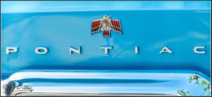
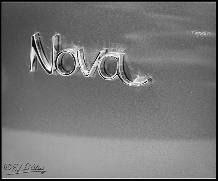
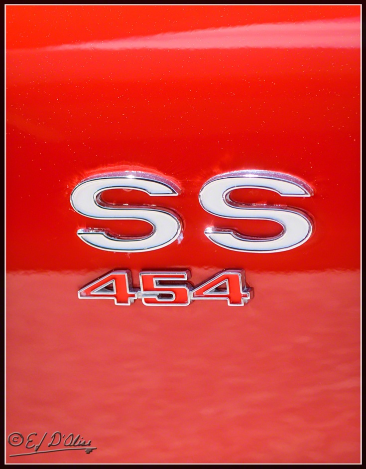
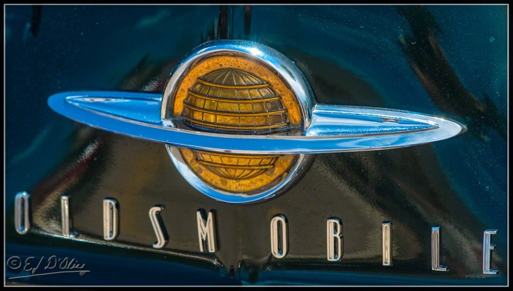
Some might argue that first shot is not much of a macro. OK, I’ll give you that, but I can’t help if the name was all stretched out across the back. OK, OK, I’ll keep the rest more in the realm of ‘macros’.
Now, some people will be positively giddy at seeing the shallow depth of field. Good for them.
Me? I was not happy when I saw these. I prefer my stuff in focus, so I consider many of the macros big failures flags waving in Force 12 Gale Winds. Then again, I ain’t a pro, so I’ll cut myself some slack.
Other fudge cracker! That sucks! . . . breathe . . . breathe . . . OK, I’m alright now.
Grand danish, that’s bad. Oh well . . .
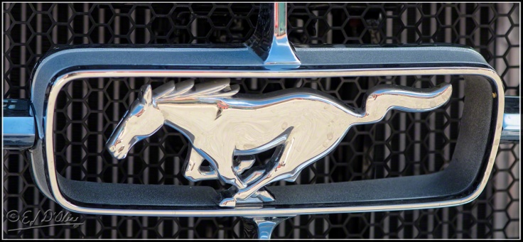
That’s more like it! In fact, I like it so much I’ll do a B&W version.
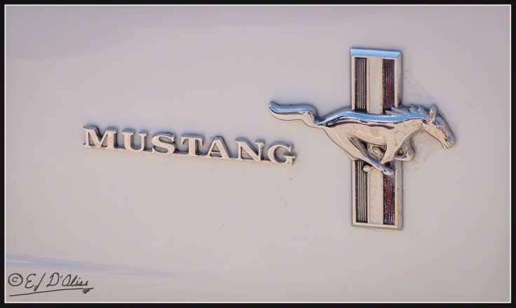
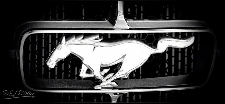
Here’s another Mustang closeup . . .
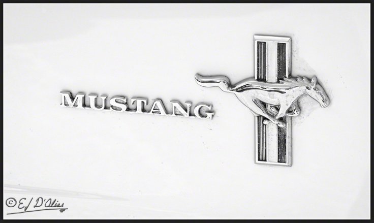
And here’s the corresponding B&W . . .
As a change of pace, I’ll give you the B&W version first and then the color original. Ain’t I a pistol?
Lest some color purists are cringing at the thought of an endless series of B&W photos coupled with their color counterparts, not all color photos lend themselves to a B&W conversion (some may differ in that opinion).
This next one most certainly does.
But, I did not do one.
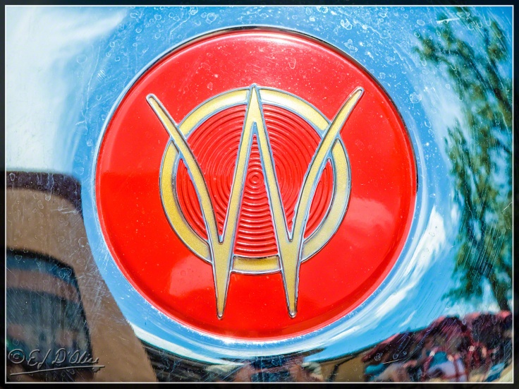
Some might recognize that emblem as two flags waving. If you can’t see it, try leaning back on your chair (or move the phone farther from your face) and squinting.
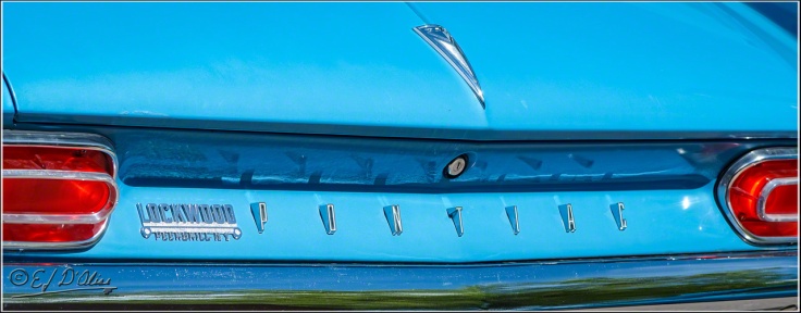
Here is a more reasonable “Pontiac” badge that possibly still qualifies as a macro.
As I walked around and concentrated on the various details, I tried envisioning the end product. Some say I have an eye for photography, but it’s actually a Nikon. The Macro lens is also a Nikon.
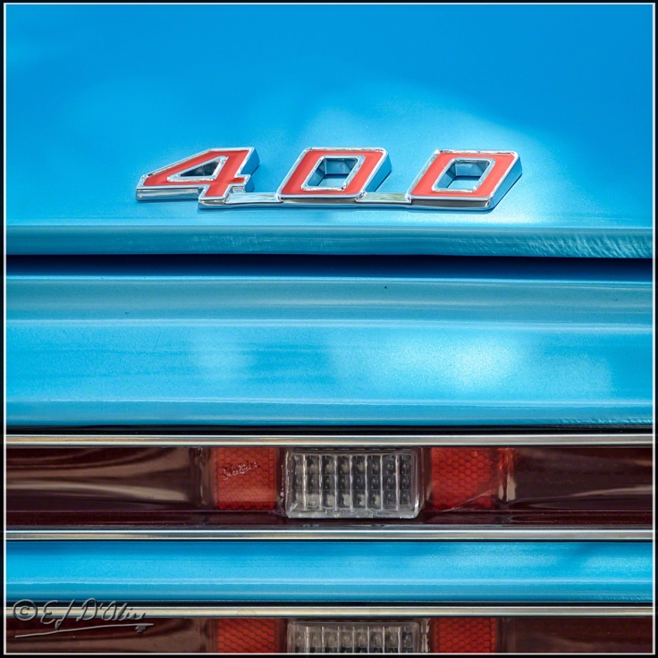
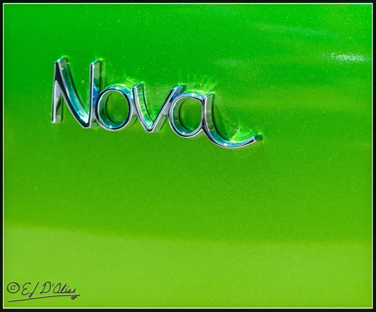
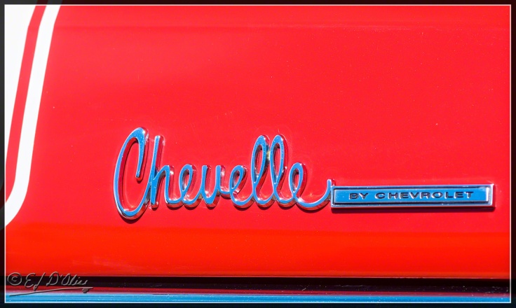
Notice that I’m not identifying any of these, proof positive that I’m not anywhere close to being what anyone might consider a car guy.
This next one looks like one of them Aztec emblems. I didn’t know they made cars.
Tsk, tsk . . . visible screws. Those Aztecs have a thing or two to learn about aesthetics.
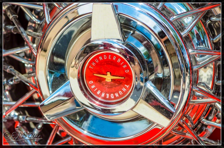
But, they sure made purty wheels. It stands to reason; some think wheels were man’s first invention after porn, so we’d had lots of time to perfect them.
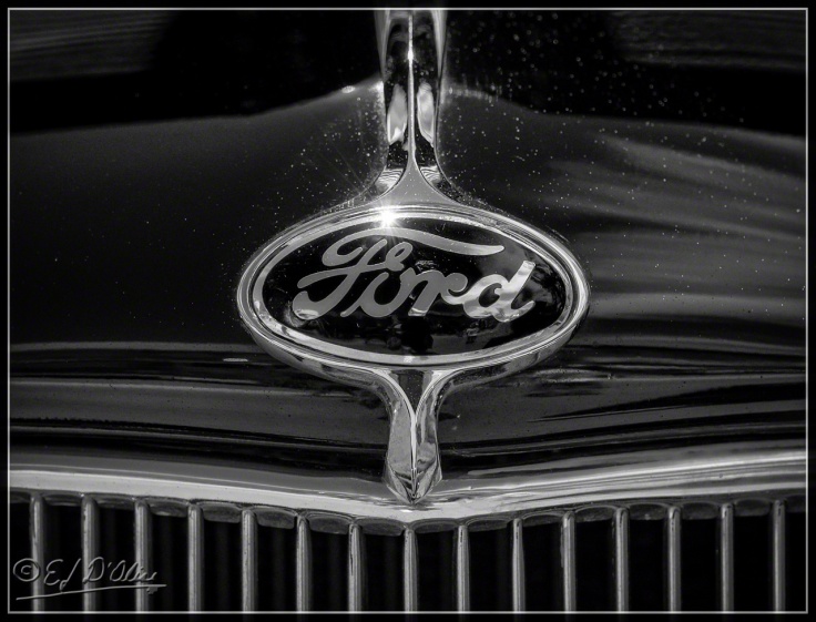
Now, I bet you think I forgot all about doing monochrome conversions . . . not so. Witness!
What is unique about that shot is that it has a reflection of me taking the photo. I tried in earnest avoiding such mishaps, but sometimes it cannot be helped.
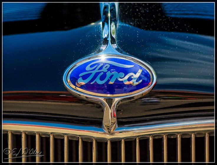
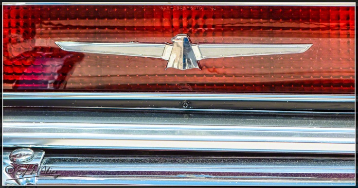
I assume this next shot is from the same vehicle as I can’t believe there would be two cars with similar logos.
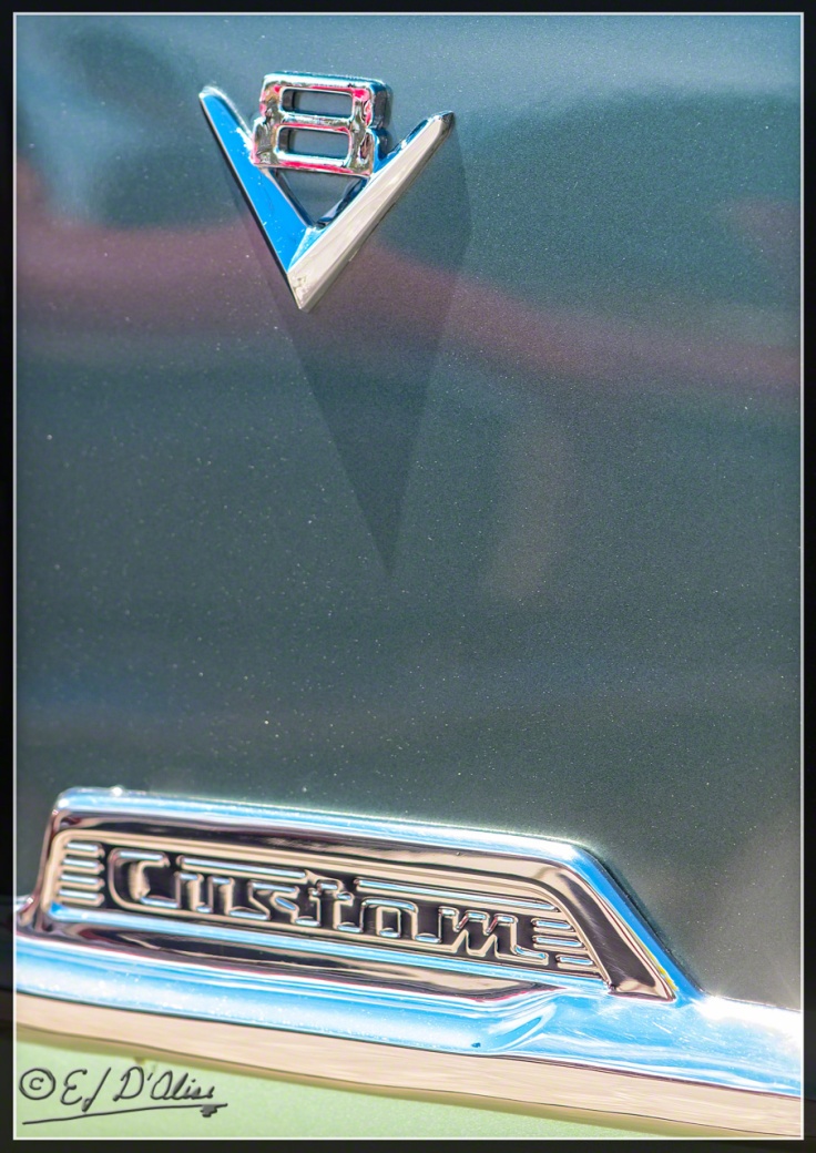
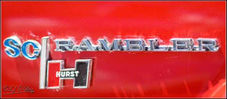
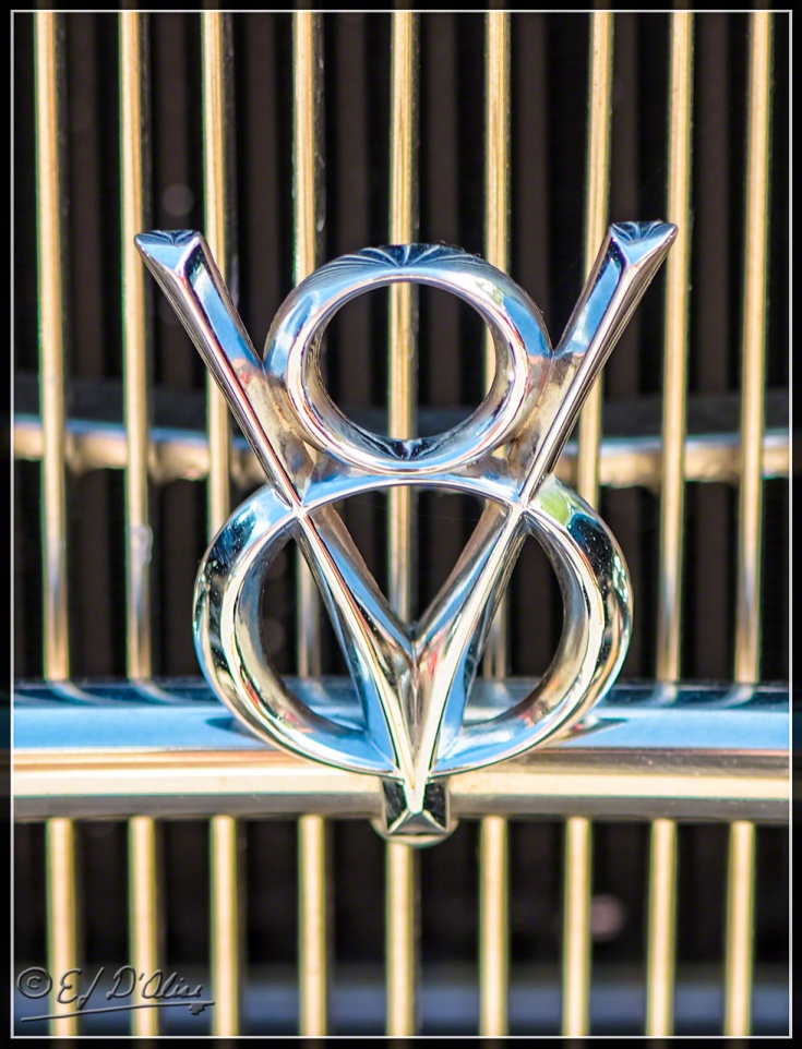
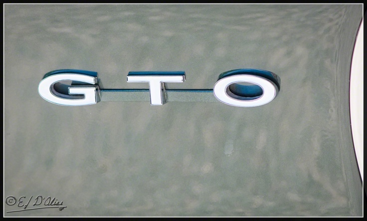
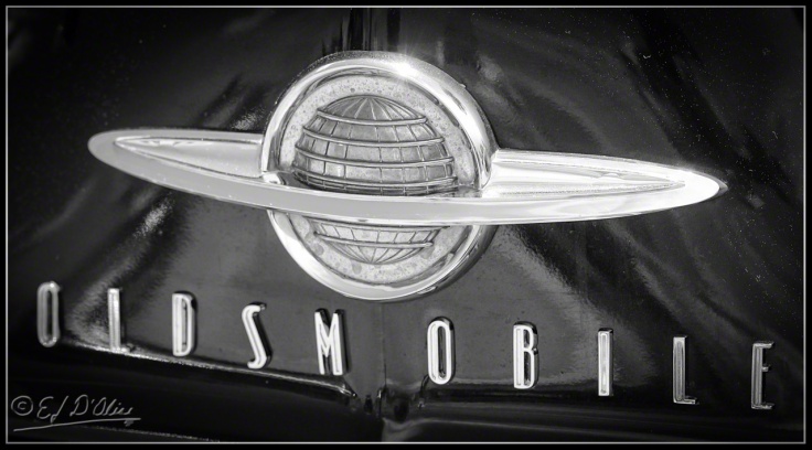
However one feels about old cars, one has to admit to a fair amount of character evident in the various adorning badges.
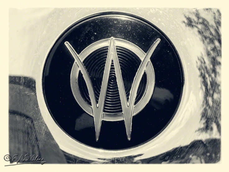
Even when fairly simple, they could still be classy.
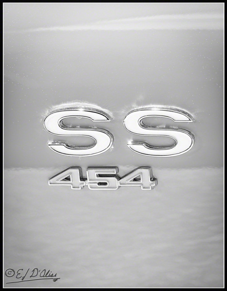
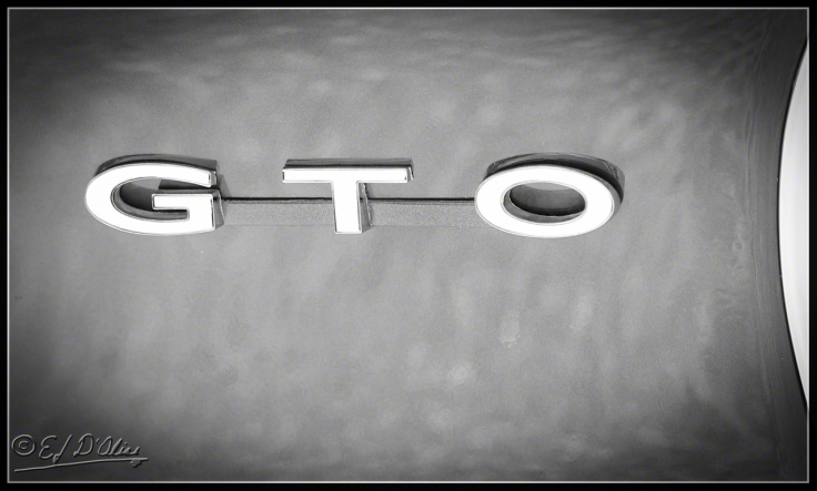
You could even label them as elegant once transformed by the magic of monochrome.
Some badges have an inherent power that has nothing to do with how they look and more about what they invoke.
Of course, I maintain a decent B&W conversion can only help.
But, yes . . . even unadulterated, the mere sight of the badge can evoke memories of rampant optimism and the very air choked with the lead residue of high octane fuel.
I’m not sure which German division this was, but I’m sure it instilled fear in the hearts of its enemies.
 This next badge if tame in comparison.
It has kind of a dainty ring to it, don’t it?
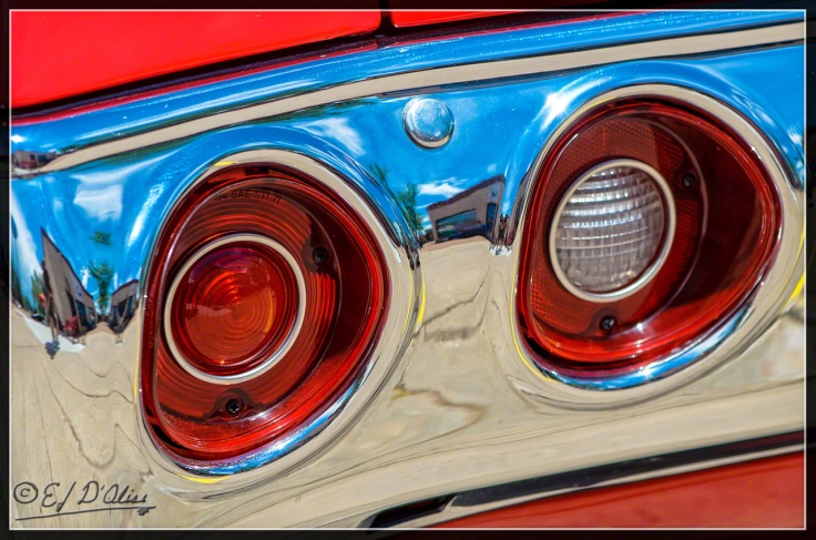
Our first car was a 1965 Impala, and hence, I’m still partial to the shape of these tail lights.
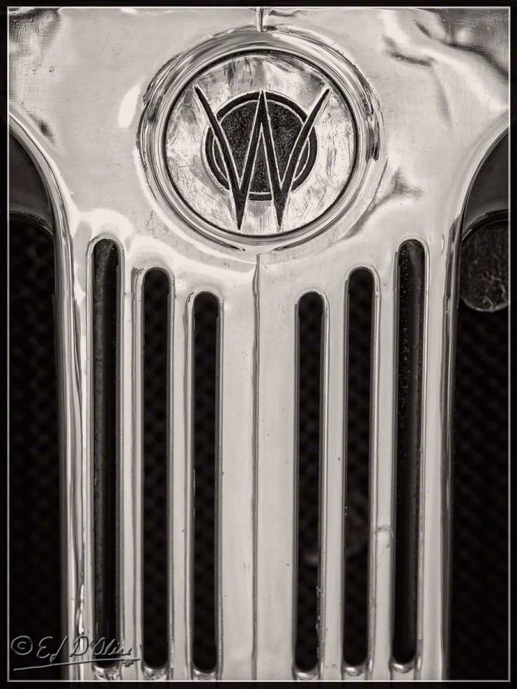
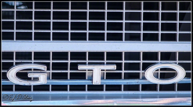
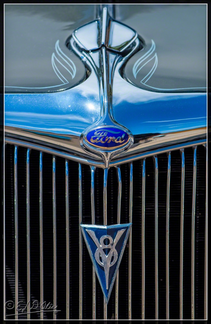
Here’s another classy hood and grille combo . . .
. . . and yet another . . .
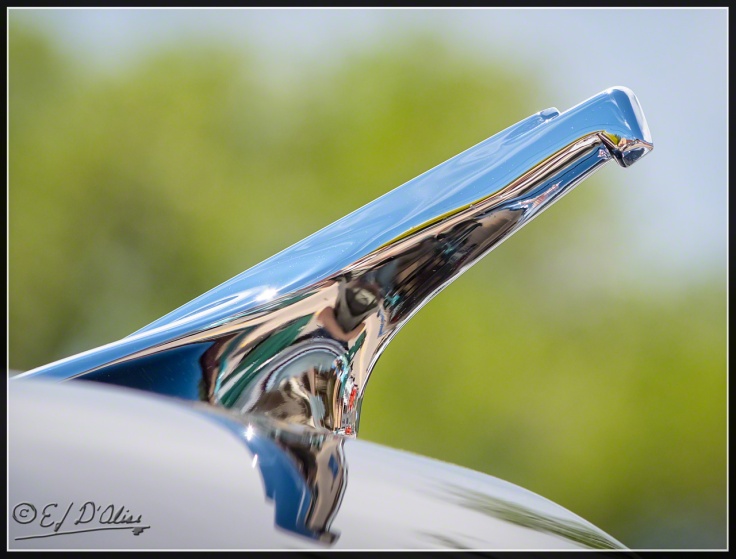
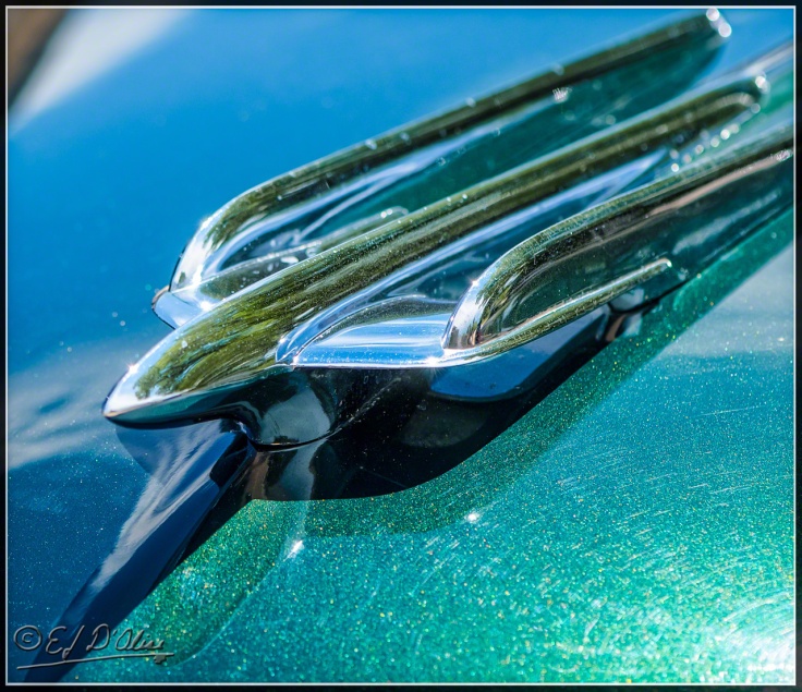
I kind of miss this next type of hood ornament . . . I mean, if you’re making the effort to hit a pedestrian, you might as well have something on the hood that can easily rip them open.
Sigh . . . those were the days.
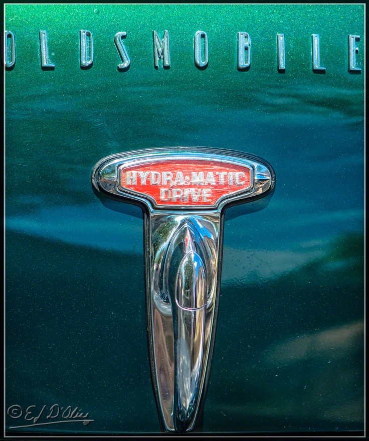
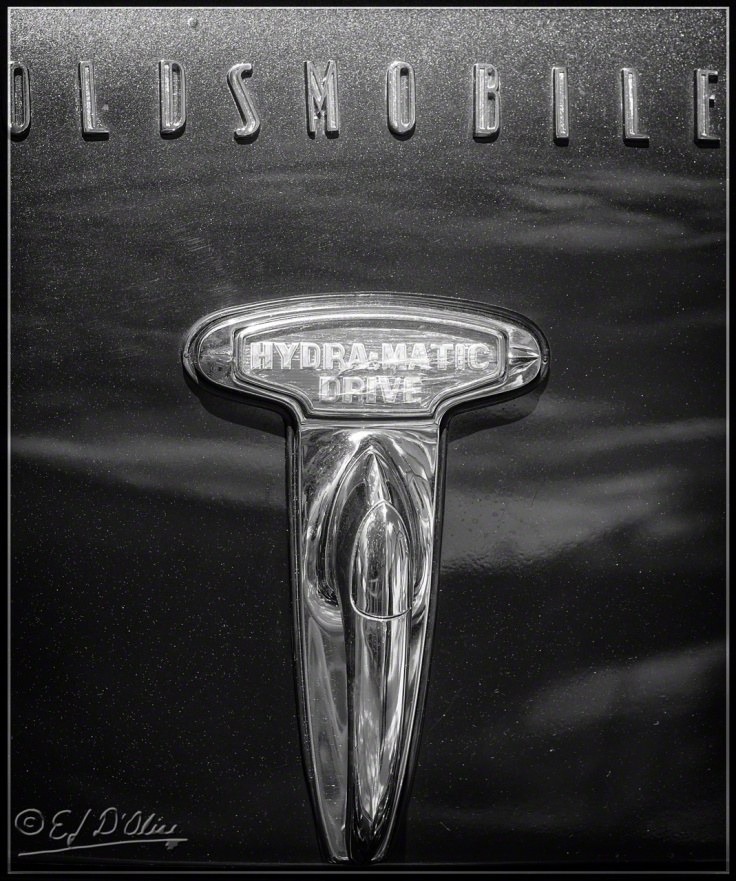
It’s not just hoods that were adorned with classy badges. I’ll end this short post with a shot of a trunk release handle.
And now, as I hit publish, I’ll marvel at getting a couple of “likes” within a minute of this post going live from people who could not possibly have read any part of it.
That’s it. This post has ended . . . except for the stuff below.
<><><><><><><><o><><><><><><><><><o><><><><><><><>
Note: if you are not reading this blog post at DisperserTracks.com, know that it has been copied without permission, and likely is being used by someone with nefarious intention, like attracting you to a malware-infested website. Could be they also torture small mammals.
<><><><><><><><o><><><><><><><><><o><><><><><><><>
Please, if you are considering bestowing me recognition beyond commenting below, refrain from doing so. I will decline blogger-to-blogger awards. I appreciate the intent behind it, but I prefer a comment thanking me for turning you away from a life of crime, religion, or making you a better person in some other way. That would mean something to me.
If you wish to know more, please read below.
About awards: Blogger Awards
About “likes”: Of “Likes”, Subscriptions, and Stuff
Note: to those who may click on “like”, or rate the post; if you do not hear from me, know that I am sincerely appreciative, and I thank you for noticing what I do.
. . . my FP ward . . . chieken shit.



Perseverance is the key then. And a sense of humor. You’ve got that. The trick, I guess, is sending them what they want when they want it, at precisely the time they need it. That has to be difficult. But not impossible. Sooner or later, you’re going to catch someone at just the right moment.
LikeLike
Thanks, Sandra.
One of the problems is that submissions and queries leave no room for the application of a sense of humor. If they could see just how clever I am, why I’d be selling tons of stuff!
LikeLike
I like these logo and hood ornament shots. I’m also glad car manufactures aren’t as obvious about identifying the cars like they used to. BTW, I think Pontiac made the Aztec. Or was that the Aztek?
LikeLike
It was the Aztek. It was actually a bit ahead of its time.
https://en.wikipedia.org/wiki/Pontiac_Aztek
One of the problems was they came out with it the first year with the lower portion of it as black matte plastic, and it made the car look cheap, in direct contrast to its high price. By the time they changed it, the vehicle had a reputation. In the last few years of the model run you could pick one up very cheap and it was a decent vehicle.
Note in the write-up that the plant was converted to making HHRs . . .https://en.wikipedia.org/wiki/Chevrolet_HHR
. . . a vehicle instrumental in us closing our company because of GM politics, backstabbing, and deception by some people we trusted.
LikeLike
It’s funny that the Aztek was criticized universally for it’s styling (which I liked) but now it seems very attractive compared to some of the new cars and SUVs from almost all manufactures. Americans (and probably the rest of the world) have embraced the ugly car.
LikeLike
Well, truthfully, the first year they were out they were rather “different”. Like I said, the big plastic panels made it look cheap, as if they had been an afterthought. They were there for durability in case you went off-road and for easy maintenance, but combined with the undersized wheels, it gave the vehicle an odd look. Once they went to an all-metal body and toned down the front end a bit, it looked quite nice.
And yes, like I said, ahead of its time. In fact, many of today’s crossovers look a lot uglier than the Aztek ever did.
LikeLike
The other day I was reading some rubbish somewhere on the ‘net about a woman who wrote a book that got rejected so she decided to have printed and published 500 copies herself. The story went on to win an Oscar.
Perhaps instead of wasting your time sending off to publishers and waiting for the rejection that you expect you should do the same as that lady did; you might also try ending them in under an antonym to disperse(r) which might be more appealing.
Just a thought , don’t like to stick my bib in but you look like a lost soul ( disperser doesn’t have one I know!) and need some good advice from a social minded socialist 😀
LikeLike
few typos there but you’ll get the drift
LikeLike
Self-publishing is the last resort because it also means self-marketing, and I rather not have to directly deal with that mess.
And, it’s not just ordering books . . . need editing, a proper cover, copy-setting, and all sorts of little details I rather not have to fuss with.
Plus, I suspect the woman had talent.
As for advice from a socialist, it’s my distinct impression the very idea of socialism is anti-books, as in oppression and censorship, if not outright banning of books.
LikeLike
I thought it was the fascist like donald trump that banned stuff, we socialist in Australia are believers in free university education for all; which includes idiots.
LikeLike
See, that’s where we differ . . . I don’t think idiots should be educated; it’s just a waste of money.
As for banning books . . . https://en.wikipedia.org/wiki/List_of_books_banned_by_governments
LikeLike
Love your very humorous, rejection-process analysis. Not to mention it all spiced up with the “coffee tabletop book” worthy ‘cruisers’ portfolio. All makes the Disperser indispersible. M 🙂
LikeLike
Thank you, that very nice of you to say . . . indispersible; I like that.
LikeLike
This made me laugh. With you. You are laughing right?! Great advice to agents and editors!
And I think you DO have a soul.
And I find you and your writing indispersable…er…I mean…Indispensable. So, please keep submitting your work. I’ve done some reading about this…and a lot of the great writers…and great books…were rejected many times before someone published them. So, yes, keep persevering and keep your sense of humor as you persevere! And please DO break their will to live! 😉 🙂
Love the car emblem, logos, hood ornaments and grille photos! Very cool!
HUGS!!! 🙂
PS…You ARE a pistol! 🙂
LikeLike
Thank you. All that is very nice of you to say . . . except the soul part, but we won’t discuss it.
And yes, that was written with great mirth in mind, so very glad you laughed.
And thanks for the compliment on the photos. I like them myself.
LikeLiked by 1 person