Since I missed the deadline last week, I figured I should get a head start on Cover Makeover #12.
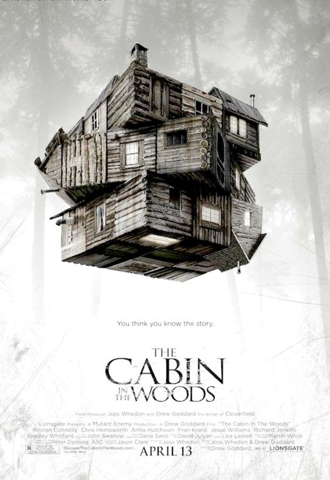
This challenge involves another movie: The Cabin in the Woods. Here is the cover from the challenge post linked above.
On my last post, my readers learned I do not like musicals. This post offers more insight into the strange and wonderful that is me . . . I also don’t like horror movies.
For the most part, they are an insult to the intelligence of people. I know people who love horror movies and are very smart and readily admit they put their brain in park when watching horror movies. In the most extreme cases, they store it in another room of the house.
By now everyone has seen this:
I hear The Cabin in the Woods is a pretty good movie, but it’s from Joss Whedon, and I’ve still not forgiven him for killing Wash and all the other characters he kills for no reason other than to satisfy his blood lust.
I read the summary of the plot, and it’s just as I suspected . . . not a movie I want to watch. I can, however, do a cover for it.
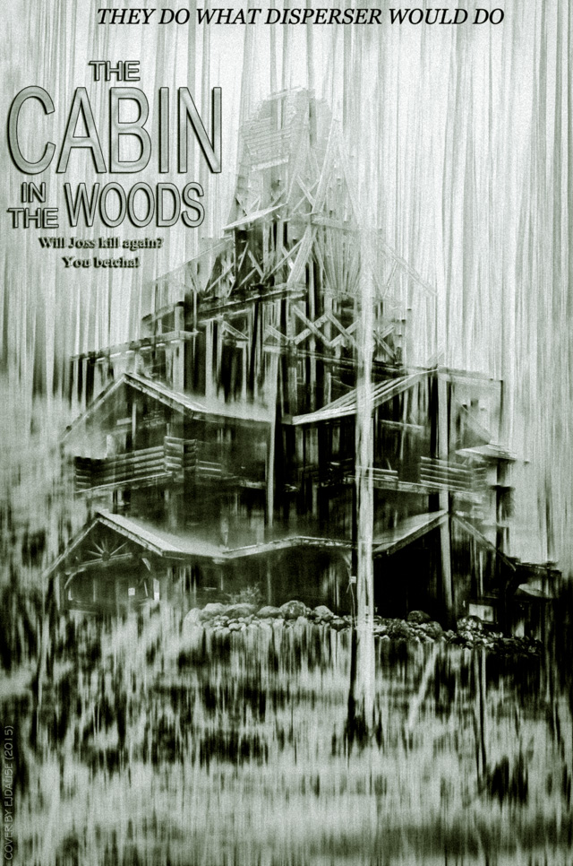
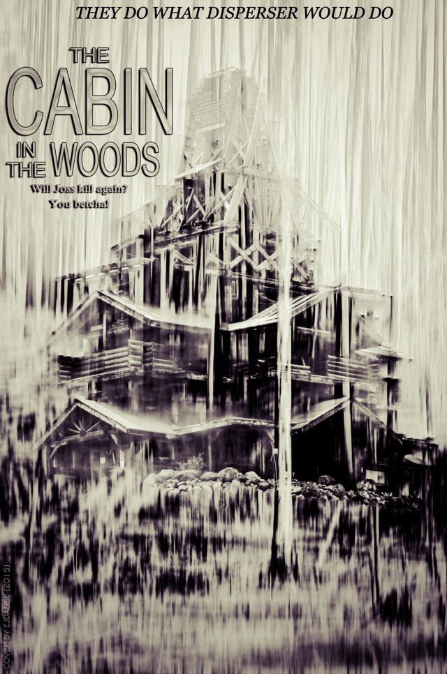
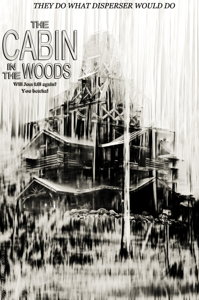
First, I need my photo of the Smith Mansion.
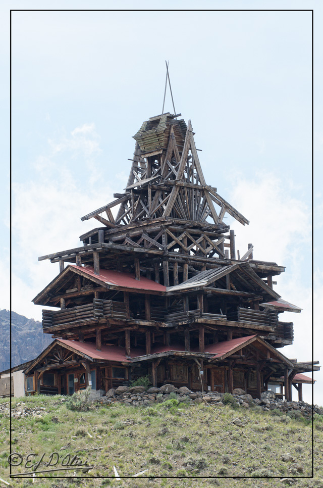
I shot that on the way home from Yellowstone just a few hours after shooting this next shot.

I chose that particular cabin because it looks strange. I chose the woods because they look stark.
First, I isolate the cabin . . .
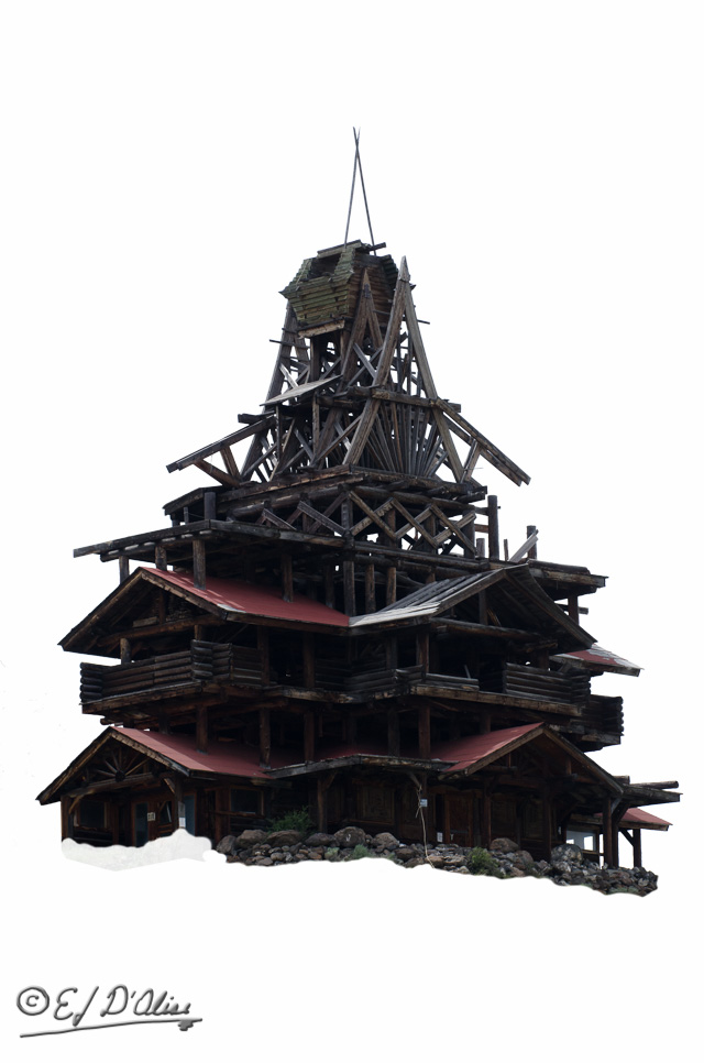
I then work some magic to “mystify” the woods using Silver Efex Pro 2 and Topaz . . .

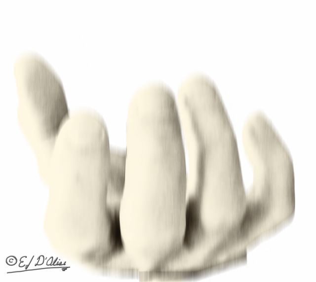
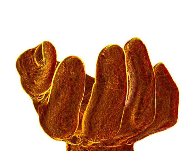
Next, I photograph my hand and do a couple of treatments on it:
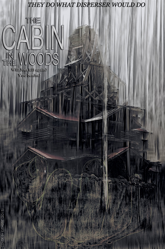
OK, this is where the readers can contribute their expertise and good taste . . . . after throwing everything into the pot and stirring, I came up with a few different looks.
. . . I am partial to this version:
But, it almost seems too cheerful, so I did a few more versions.
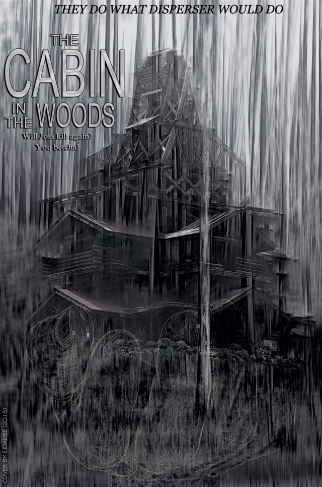
When I looked at that, I wondered how it would look in a monochromatic version . . .
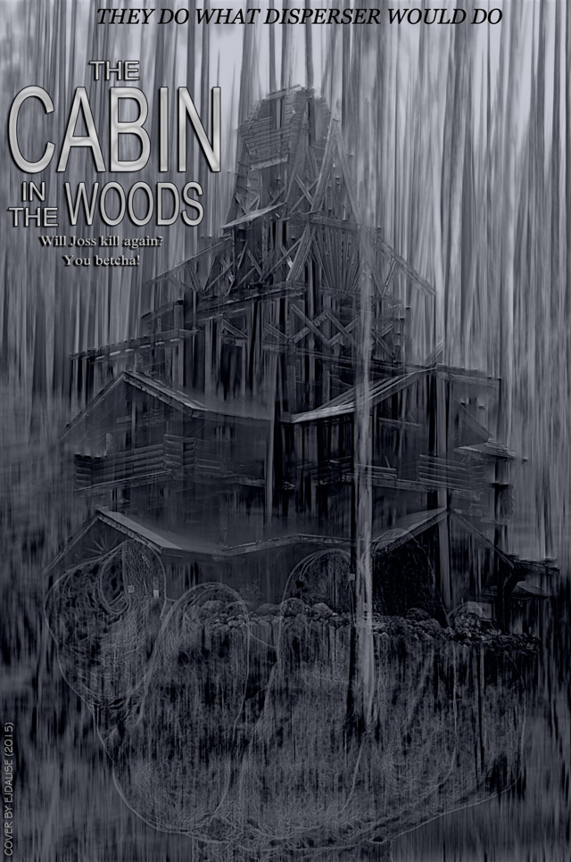
I liked this version, but it did not seem menacing enough for a horror movie, so . . .

Those are tough choices, so let me give you one that is clearly different . . .

I should make a few comments preempting readers jumping all over me for the following:
- yes, I know it’s too busy for a movie poster
- yes, I know titles have prominent positions in movie posters
- yes, I know movie posters have all that fine print at the bottom
Here’s the deal . . . think of it as the cover to the book adaptation of the movie.
Ok, with that out of the way . . .
I hope this exercise in a bit of escapism has entertained you. If not, don’t tell anyone about this post. Unless there is someone you don’t like, in which case point them here so they too can suffer.
Edited to add: Here are a few without the hand . . .
That’s it. This post has ended . . . except for the stuff below.
<><><><><><><><o><><><><><><><><><o><><><><><><><>
Note: if you are not reading this blog post at DisperserTracks.com, know that it has been copied without permission, and likely is being used by someone with nefarious intention, like attracting you to a malware-infested website. Could be they also torture small mammals.
<><><><><><><><o><><><><><><><><><o><><><><><><><>
Please, if you are considering bestowing me recognition beyond commenting below, refrain from doing so. I will decline blogger-to-blogger awards. I appreciate the intent behind it, but I prefer a comment thanking me for turning you away from a life of crime, religion, or making you a better person in some other way. That would mean something to me.
If you wish to know more, please read below.
About awards: Blogger Awards
About “likes”: Of “Likes”, Subscriptions, and Stuff
Note: to those who may click on “like”, or rate the post; if you do not hear from me, know that I am sincerely appreciative, and I thank you for noticing what I do.
. . . my FP ward . . . chieken shit.

It was a toss up for me. I liked version one and three. Chose version one. It is kind of busy. I don’t think the hand is needed because it’s already stark and sinister. I love what you’ve done here. 😉
LikeLike
Yeah, I debated about the hand. The thing is, I invested time and effort into it, and it posed for me; I kind of owe it some screen time.
And, thanks.
LikeLiked by 1 person
Why do people conducting polls never give one the following option:
6) No of the above.
Consequently I had to either abstain from voting or vote for second best and exercising my democratic right to vote I went for #…
LikeLike
I normally include a “I don’t give a crap” option, but I was in a hurry, and forgot to do so. Wait a few minutes, and it will be there.
LikeLike
To late I already voted.
LikeLike
In truth I found them all to busy and not nearly stark enough for my liking, I was too busy working out what is going on to be scared, but then I don’t suppose I scare easily, can you select a happier subject next time ej I need cheering up. 😦
LikeLike
Lord knows, or in this case, don’t knows, I don’t pick them.
LikeLike
Besides, you did not like the cheery Sound of Music one.
LikeLike
I thought the hand was unnecessary. Why would someone be holding a cabin in their hand? I thought the building was great. I thought the trees could have been a little less prominent. I thought I’d vote twice but I should have known you’d be the type not to allow that (based on the fact I don’t either). The hands free ones were interesting, if a little too much blur.
LikeLike
The hand plays a role in the movie. I probably should have left it out as I could not make it sinister enough.
The blur is the same in all the photos but the brightness and saturation varies. It gives it a glow effect.
LikeLike
Maybe rather than holding the cabin, it could have been trying to take it from above. Irrelevant I haven’t watched the film. I am just thinking spookiness. The building is still tops, it is perfectly weird.
LikeLike
If you read the synopsis in the Wikipedia link you’ll get a bit more insight on the hand.
LikeLike
v5 is my choice but I like the ones without the hand, too. I did see the movie and the hand was a nice addition but it may be too much of a give-away. This is one of the best makeovers.
LikeLike
Yeah, I thought about that, but it’s probably only a give-away if one has watched the movie.
LikeLike
Maybe that is not your plan but you are an entertainer.
I share the same horror for horror movies. I cannot possibly understand the choice. Well, I don’t understand human’s choices anyways.
The hand was quite creepy, so it would serve well a horror movie…
As always I’m following your steps in disbelief with my incompetence and (laziness) to watch the tutorials and learn to use Photoshop.
Great work as usual.
PS. Is the voting secret? 😉
LikeLike
Thank you.
The hand, as mentioned on other comments, plays a role in the movie. As for the photoshop expertise required with this one, it’s minimal. All the processing is done with Topaz plugins and onOne Effects before bringing the photos into Photoshop; these are canned settings from those program. The blending once in Photoshop is just layers with different opacities and blend options. The last three are just different styles from Topaz’s Restyle plugins.
The voting is secret but not by intent. I’ve never bothered to find out if I can identify the individual voters. The tally or results can be seen by clicking on the “View Results” option right under the “Vote” button. You can often identify who voted for which photo from the comments although some people do vote without leaving comments.
LikeLike
Most welcome!
It’s even more complex than I thought! I don’t know if it challenges me or discourages me! 😉
I’m really ignorant in all of this. I have Lightroom and photoshop came with the package but I didn’t start yet to use it.
I was asking about the voting because I didn’t mind saying that I went for version 5.
I saw the results already!
LikeLike
Nope, no more complex than sliders in Lightroom.
Do this:
1) select two photos in Lightroom (hold the Cntl key as you pick them)
2) right-hand click and choose “open as layers in Photoshop”. Photoshop should open automatically if it’s not already open.
3) On the side panel, where the layers are shown, pick the top-most layer, and change the opacity and fill sliders to get different amounts of blending. Right next to the opacity there is a box for the type of blending (it defaults to “normal”). Change it to any of the other options to see what they do (one group makes things darker, another lighter).
Optional (select both layers):
Under the Edit menu there is an option for “Auto-blend layers”. Choose the option to blend colors.
When done, close and save, and the result returns to Lightroom as a PSD file (usually; unless you chose a different option). You can them make further changes there.
LikeLike
I’m with you. I don’t like horror flicks (but I’m a sucker for musicals). I like #1 first and #5 second. You did a good job with all of these. Nicely creative.
LikeLike
Maddie, long time no hear. I hope your writing is going well.
Thank you, and sorry to hear about musicals.
LikeLike
I think the musicals came about from lots of music in the home. I gravitated toward movie musicals as a youngster. My writing is going well, thank you. I’m trying to write two at one time, so my time reading/writing blogs has been scarce. I’m taking a break today and am glad I did. I enjoyed your cover makeover.
LikeLike
Only two at a time?
So, breezing it, then; good for you.
LikeLike
I love mystery-sci-fi-y horror movies…not slasher inane teenagers ones.
Ooh! I love when you let us vote!
HUGS!!! 🙂
LikeLike
“The Thing” . . . the original with Kurt Russel.
LikeLiked by 1 person
Very well done. I’m drawn to the red in version 5.
LikeLike
Thanks . . . festive version has a comfortable lead in the poll.
LikeLiked by 1 person
The hand is a very smart addition. This is an awesome recount of your process again and cool covers that you’ve created.
Man, you don’t like horror either?! I’m having the worst time picking titles.
Sorry for the delay, almost getting back to “normal” here.
LikeLike
I like action (The Mummy, Hitman), some romance (a la Six Days, Seven Nights), science fiction (can’t think of any right now), smart comedies (Joe Versus the Volcano, Creator). Not big on drama, horror, musicals, literary works, pretentious musical acts who strive to “look cool”, redemption movies/shows/books, and a bunch of other stuff that I consider as self-indulgent and of no value to humanity.
Good luck with getting back to normal . . . my experience is that one never quite recaptures what they thought of as normal. Some say that is a good thing.
LikeLiked by 1 person
I like those movies too. But I love good horror or thrillers. I hate musicals generally. And I used to love disaster movies but haven’t seen a good one in years. Yes – normal, it’s an interesting concept!!
LikeLiked by 1 person
The covers with the hand are creepy but the ones without are scarier. I was going to choose #5 because of the blood red but then thought it did make it too festive. #1 seems just right to me.
LikeLiked by 1 person