The effort for Cover Makeover #10 turned out as the most time-consuming to date. Not because the cover I made is complicated (read “busy”) but because I had a number of false starts as I tried to realize my vision.
The challenge this week is to do a makeover of The Lord of the Rings. Here is the cover from the post linked above.

Fair warning, the end product is not exactly what I had envisioned. For instance, I wanted to include my running Ent:

I also wanted to use some geographical features from Kauai . . .

Alas, I had too much stuff to blend it all to my liking. The Ent and Kauai had to go.
So, here’s the process . . . first, I had to take a photo of a ring. Melisa is still able to easily get her ring off (I can get mine off only after a lot of effort and a moderate amount of swearing) so I used her ring and one of her gold chains laying on black glass for my seed photo of the ring.

I then downloaded a number of elvish looking fonts and added some writing . . . .

The outer writing says (maybe) “life sucks but at least it is short”. I say maybe because that is what the letters spell out, but I don’t know elvish so that particular arrangement of letters is not likely to translate into something Sauron or Elron or any other rons might recognize. The inner writing spells out something regarding Disperser (that’s me) ruling above all . . . an obvious lie.
At this point, I was pretty happy . . . then I realize that glass creates a mirrored image. Back to the drawing board and . . .

Because it was not done at the same time and because the original path was erased, that is a very poor mirror image of the lettering. It would have to do; I am not about to redo all of that.
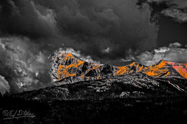
Next I needed Mount Doom. Odd that, but I could not find any Mount Dooms in Colorado. OK, OK . . . I did not look real hard; I just grabbed this photo of Pikes Peak.

While I was at it, I grabbed these photos as well . . .


I don’t explicitly say it every time but it should always be assumed I either use my own photos or create components from scratch. None of this stuff, including representations of logos or other items, are copied. I do use existing fonts, but only those that are free for personal use.
So, let’s start with Pikes Peak and change it to Mount Doom . . .

Not quite there yet . . . let’s take the snow and convert it to lava.
Pretty good, but still not “doomy” enough . . .

Better. Now, cut out the tower, clean it up, crop the mountain, and merge the two to get this.
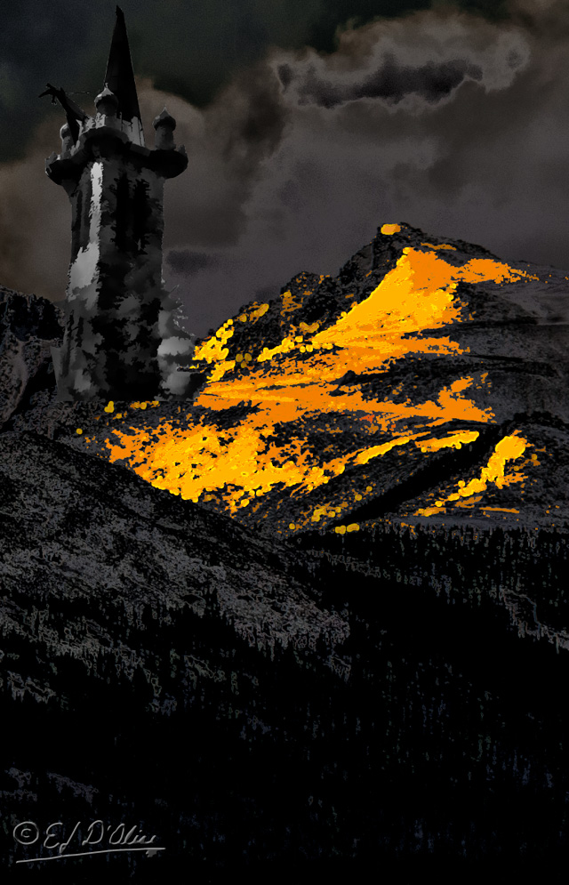
Passable.
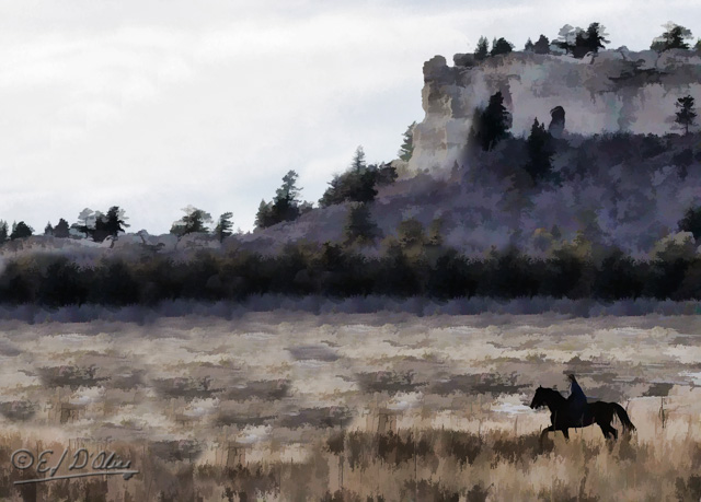
Next, I need a lone rider, so I modify the riders to this . . .

. . . and then this . . .
Now, blend all them things in there, play with the tower to add a wizard-like figure complete with shining staff, and you get this:

Next, download the fonts used in the movie (free for non-commercial use), and you get this:
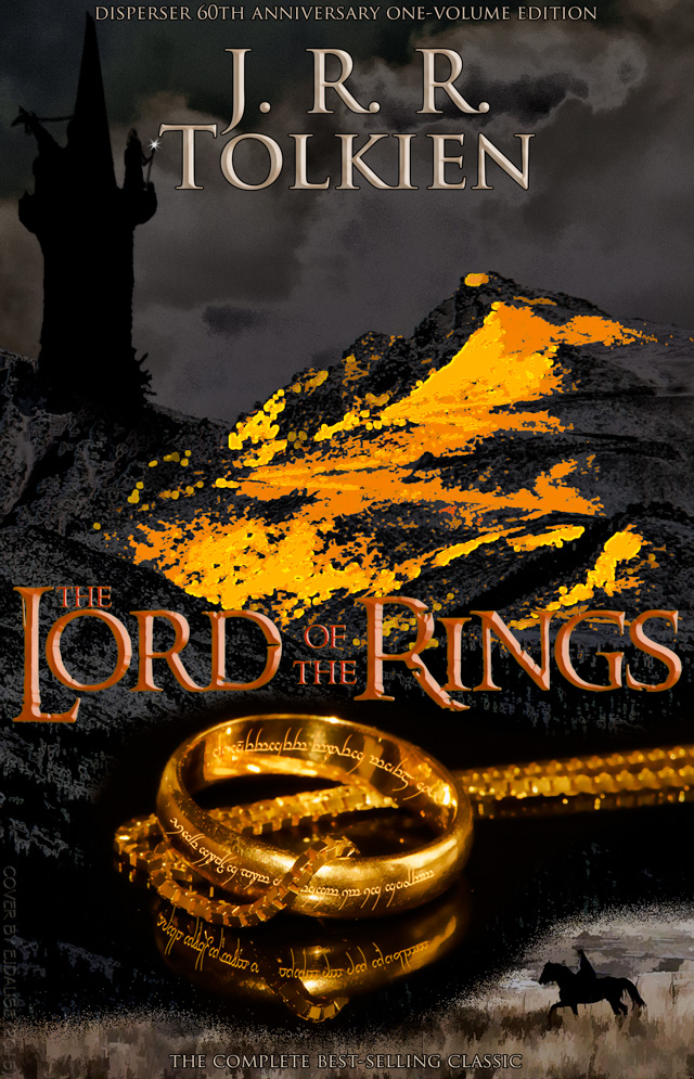
Even without all the neat stuff I had originally planned, I think this captures the spirit of the book. I could have added other touches, but it’s good enough to stand as is.
I hope this exercise in a bit of escapism has entertained you. If not, don’t tell anyone about this post. Unless there is someone you don’t like, in which case point them here so they too can suffer.
That’s it. This post has ended . . . except for the stuff below.
<><><><><><><><o><><><><><><><><><o><><><><><><><>
Note: if you are not reading this blog post at DisperserTracks.com, know that it has been copied without permission, and likely is being used by someone with nefarious intention, like attracting you to a malware-infested website. Could be they also torture small mammals.
<><><><><><><><o><><><><><><><><><o><><><><><><><>
Please, if you are considering bestowing me recognition beyond commenting below, refrain from doing so. I will decline blogger-to-blogger awards. I appreciate the intent behind it, but I prefer a comment thanking me for turning you away from a life of crime, religion, or making you a better person in some other way. That would mean something to me.
If you wish to know more, please read below.
About awards: Blogger Awards
About “likes”: Of “Likes”, Subscriptions, and Stuff
Note: to those who may click on “like”, or rate the post; if you do not hear from me, know that I am sincerely appreciative, and I thank you for noticing what I do.
. . . my FP ward . . . chieken shit.

You have intended nor imagined that someone would not suffer but enjoy very much going through the steps you took to make this cover.
I’m always fascinated with your thinking process and your photo processing skills. I know you’ll say that there are tutorials, but alas I couldn’t yet go through it. Maybe next time when it’s my turn to make the cover for our challenge.
It’s again a great cover. Chapeau!
LikeLike
Thank you. Always glad to entertain . . . er . . . fascinate.
LikeLike
That’s great to hear! You’re welcome.
LikeLike
Nice cover. The horseback rider is a nice touch.I’m at a slight disadvantage because there are no mountains like Pikes Peak in Webster ( Where Life is Worth Living ) so I would have to take a different approach.
LikeLike
Thanks, and two words for you . . . Dead Marshes.
LikeLike
YOUR cover is w-a-a-a-y better than the original! Your cover captures so much about the book and is intriguing…I would buy the book because of the cover…wanting to get inside and read! As always on these…I enjoy reading about, and seeing, your process! And you always make me snort-laugh at least twice! 😛 HA! on the elvish writing! 😀
HUGS!!! 🙂
LikeLike
Thank you; I had more stuff in mind, but it was getting too crowded.
. . . also, I’ve come to realize it’s not really all that difficult making you snort-laugh. It is difficult trying to keep it down to just twice.
. . . just to be clear, that’s a good thing.
LikeLiked by 1 person
HA! 😛 Yes, I laugh easily and often! 🙂
LikeLike
Very interesting to see how you created that cover…..that would certainly catch my eye in a bookstore or library!
LikeLike
Thanks, Sandra. Perhaps someone in the publishing industry will read that and give me a job doing this.
LikeLike
Great job on that ring! Not sure I’d have noticed the missing reflection if you hadn’t mentioned it. And what/where is that tower? It fits the role perfectly.
LikeLike
That is actually in Colorado and fairly famous . . . it’s Bishop’s Castle. I wrote about it here:
The SmugMug album has a few more photos than the blog post. (http://smu.gs/1VI8doj)
LikeLike
Fascinating. I’d heard of Bishop’s Castle but I don’t recall ever seeing a picture of it. Have done very little traveling south of I-70 or west of I-25.
LikeLike
I tried reading The Hobbit back in the 70’s and couldn’t figure out what all the excitement was about, but what you’ve done here is pretty cool.
LikeLike
The Hobbit is a much different animal than the trilogy. That said, you can do just as well watching the movies (not the Hobbit movie; that’s mediocre at best).
OR . . . you could read “Bored of the Rings” by National Lampoon. You can then follow the adventures of the Boggies Dildo, Spam, Frito, Moxie, and Pepsi as, aided by the wizard Goodgulf Grayteeth, Arrowroot son of Arrowshirt, Legolam, Gimlet son of Groin, they embark on their quest.
One thing; at 98 pages it’s an easy read, but you will afterwards never be able to read the actual trilogy.
LikeLiked by 2 people
Super impressive! I really, really, really like it!!! And as always, I enjoyed the creative process, too.
LikeLike
Thanks; it did turn out pretty well even without the other things I was planning.
LikeLike
I’m going to try and find Bored of the Rings, sounds like fun!
LikeLike
Oh, it is . . . it probably was even instrumental in shaping my own skewed sense of humor.
LikeLike
Great cover again. I have the ring and wanted to include it in my cover but was too lazy. I’m so impressed that you made one yourself with reflection and all! Great great work.
LikeLike
Thank you. As I keep on saying, it’s interesting for me to try new things and work out how to do stuff.
LikeLiked by 1 person
Wait . . . you have The Ring? The One Ring!? And you blurt that out, just like that?!
LikeLiked by 1 person
Right?!?! I’m sure the others must be fakes.
LikeLiked by 1 person
love!!!!!
LikeLike
Thank you.
LikeLiked by 1 person
All your effort was worth it – your cover works brilliantly!
LikeLike
Thank you.
LikeLiked by 1 person
Simply stunning. IT is streets more interesting and captivating than the original. Very inventive.
LikeLike
Interesting phrase; “streets more” . . . I’ll have to incorporate that in my mode of speech.
LikeLike
A term I have grown up with, and thought was in international currency.
LikeLike
I got the meaning even without familiarity to it. Like I said, I’ll be incorporating it in my parlance thereby raising its exposure to all my readers . . . all ten of them.
LikeLike
Wow, this is crazy. What an outstanding job!
LikeLike
Thanks . . . and I’m actually fairly lucid . . . most of the time.
LikeLiked by 1 person
😀
LikeLike
disperser … The original book cover is not as compelling as the one you created. Excellent. I love the ring, the writing on it, and the rider on horseback. Wonderful touches. 😉
LikeLike
Thank you. Glad you liked it.
LikeLiked by 1 person
I had forgotten all about this cover . . . and the brilliant creativity that flowed out of your mind . . . IMPRESSIVE!
LikeLiked by 1 person