As I get to know more about my fellow Viable Paradise 19 class attendees I am corrected about a major misconception. The class is not as “young” as I thought. I assumed the majority would fall into the 20s-30s range of ages, and while there are some in the 20s and 30s, there are more in the 40s and up. There are even a few approaching my age, but so far I maintain seniority (age only).
In hindsight, that stands to reason; tuition is not cheap, travel is not cheap, and lodging is not cheap. Someone farther along in their real-world career probably has a bit more resources than someone just starting out.
Regardless, the level of enthusiasm is still high, and people are looking forward to the experience. It’s because it’s so high that I assumed a younger crowd . . . I must be the only old person with a subdued demeanor.
. . . won’t I be fun at the informal gatherings . . .
There is a hashtag of “#VP19” for people to connect and easily track posts about the workshop. Past workshops attendees identify themselves as, for instance, having attended VP XVIII (Viable Paradise 17).
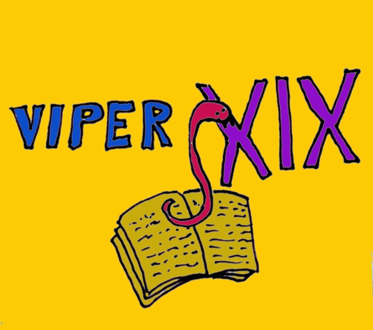
The class I will attend will be Viable Paradise XIX or VP XIX.
Following that logic, attendees could be called VPers XIX . . . to me that sounds like the word “vipers”, so I suggested an idea for a logo.
I suggested this class call itself Vipers XIX and run a logo of a viper rising from a book in place of the letter “s” and biting into the roman numerals. Of course, descriptions are difficult to visualize, so I drew a sketch . . .
One thing should immediately be evident to all . . . namely, them people who insist there is an artist within me are a tad generous with their assessment.
I suggested the above as a starting point for someone with actual graphic art skills to embellish and take to the next level. For instance, perhaps the snake should be biting into a book since we all have aspirations of getting published.
The conversation then morphed into possibly getting tattoos, t-shirts, or mugs.
Well, crap . . . if we are going to do something serious with this, I thought I should give it a better effort. I grabbed a freely licensed snake sketch from THIS SITE and made a more serious effort using Photoshop.

I know at least one person (not a fellow Viper) said they preferred the one with the anemic snake . . . I’m not sure if he was serious or not.
Honest, I’m not married to the idea or even this logo; I reiterated my suggestion other VPers, VPers with actual talent, put forth their suggestions. We’ll see how it goes.
The above is the most work I have done in Photoshop in the last three years or so. I mean, I use it for photographs, but only to merge panoramas, merge layers, and so on. I don’t actually edit the photographs in Photoshop.
. . . and then I chanced on THIS POST which pointed me to THIS CHALLENGE.
For them too lazy to click on the links (or them with a pathological aversion to doing so), let me briefly summarize the challenge. Take an existing book cover, in this case, this one:

Using one of your own B&W photographs, perform a cover makeover.
Well, shoot . . . Photoshop was already open, so I gave it a shot:

I was not happy with the impact of the name; I thought it blended in too much, so I tweaked it a bit.

It’s a subtle change, but I think the name stands out more.
. . . I still had Photoshop open . . .

We have arrived at the reader participation section of the post:
. . . and . . .
I should stress I have not read the book or even heard of Louise Penny. I assume there is a high likelihood both covers are a serious mismatch of the book’s actual content; I was just going on the title.
If the story has a Metropolitan setting, neither covers make any sense.
Anyway, that’s it. This post has ended . . . except for the stuff below.
~ ~ ~ ~ ~ ~ o o o o o o ~ ~ ~ ~ ~ ~
Astute persons might have noticed these doodles, and correctly surmised they hold some significance for me, and perhaps for humanity at large.
If you click on the doodle, and nothing happens, this is the link it’s supposed to go to: https://disperser.wordpress.com/2011/12/26/palm-vx-and-i/.
<><><><><><><><o><><><><><><><><><o><><><><><><><>
Note: if you are not reading this blog post at DisperserTracks.com, know that it has been copied without permission, and likely is being used by someone with nefarious intention, like attracting you to a malware-infested website. Could be they also torture small mammals.
<><><><><><><><o><><><><><><><><><o><><><><><><><>
Please, if you are considering bestowing me recognition beyond commenting below, refrain from doing so. I will decline blogger-to-blogger awards. I appreciate the intent behind it, but I prefer a comment thanking me for turning you away from a life of crime, religion, or making you a better person in some other way. That would mean something to me.
If you wish to know more, please read below.
About awards: Blogger Awards
About “likes”: Of “Likes”, Subscriptions, and Stuff
Note: to those who may click on “like”, or rate the post; if you do not hear from me, know that I am sincerely appreciative, and I thank you for noticing what I do.
. . . my FP ward . . . chieken shit.

I’ll come back to this in the morning over my second cup of tea!
LikeLike
Wow . . . I don’t even rate the first cup of tea.
LikeLike
Without the first I’d never get to the second! As for your polls, I’d have to go ‘other’ for both, but the words escape this morning, too busy drinking tea.
LikeLike
Words have a habit of doing that.
LikeLike
Can we not have multiple choice? 😦
LikeLike
. . . there can be only One . . .
LikeLike
Except there was Other
LikeLike
. . . other is still only One; you just get to write it in.
LikeLike
Sorry; I see what you mean. The “other” shows up when I go to Polldaddy. They used to show up under the poll, and I don’t know why not for this poll. But, I did get the comments.
LikeLike
Polecat papa took my comments on the ‘other’ vote and swallowed them?
I like your design, but with the professional look, and I think your first two covers are much more enticing than the original.
LikeLike
Sorry; normally the “other” shows up with the results, so I don’t know why not this time. I did read the “other” submissions, although I don’t know for sure who they are from . . . well, I do because of the comments.
LikeLike
The ‘other’ bar appeared, but none of what the ‘other’ voters had defined as ‘other’. Maybe that’s just how it is.
LikeLike
Here are all the comments that came through as “Other”:
If there were more, they did not show up.
LikeLike
Still hoping for a photoshop snake, but a little more cuddly.
LikeLike
I needed something quick and in the shape of an “s”. That’s the first on I found that fit the bill.
. . . wait . . . snakes don’t have bills . . .
LikeLike
Okay, I voted! I don’t know if you can tell how any reader votes but rest assured, your Photoshop skills are up to the task.
LikeLike
If there is a way to check, I don’t know about it. Essentially, unless one writes a comment about how they voted, there is no way for me to even guess.
LikeLike
“anemic snake”…snort 😛
I love voting, so I shall!
HUGS!!! 🙂
LikeLike
I think I give better choices than most elections, so vote away.
LikeLiked by 1 person
You gave good and fun choices!
(I liked in college and grad school when the profs gave multiple choice and some of the choices were silly or weird!)
I voted for the top choice in both categories!
HUGS and Have a fun and safe 4th!!! 🙂
LikeLike
Thanks, and you do the same.
LikeLiked by 1 person
Thanks for joining the CoverMakeover challenge. Fantastic covers, particularly that first long road. Beautiful.
LikeLike
You welcome; glad to contribute and thanks for the comment
LikeLiked by 1 person
I like the second Louise Penny cover remake, it fits the title very well, but as you as said, it may not fit the content. And you created a very interesting logo for the ‘vipers’. With so much creative juice flowing for the above projects, I’m quite sure you’ll have plenty left for the writing workshop. Good luck to you and hope you have lots of fun.
LikeLike
I’m looking forward to it, thanks.
LikeLike
Doesn’t look much like a viper to me but then I’ve been off the booze for a while!
LikeLike
Ah . . . I see; previous compliments of yours were all based on you being sauced.
LikeLike
Of Course! Why else would they have been so complimentary? 😀
LikeLiked by 1 person