Yessiree, boys and girls! Step right up as I try sounding like I know what I’m talking about!
OK, I kid . . . I have no idea what I’m talking about, and I’m not about to pretend I do. I can, however, talk about what I, in ignorance, do after I snap a photo and before it appears on this blog. Specifically, cropping and post-processing.
In case anyone wonders why I’m sharing my lack of expertise, it’s because I recently came across a post on cropping, and it struck me how different people see things. Also, I’ve noticed a number of blogs posting photos that to my tired, old, and myopic eyes looked as if they could have used a tad more brightness or a bump in exposure.
There be nuthin’ I like me better than suggestin’ stuff to people . . . this despite 99.9% of the people 1) don’t want no suggestin’, and 2) promptly forget any offered suggestin’.
That don’t faze me none . . . here we go.
This is a photo of a Kestrel. Shot with a long zoom and against the light, it was taken a few days before my Woodland Park job and I parted company. Perhaps the photo was an omen of dark things to come . . .

. . . but, no . . . out of darkness one can find something bright.

So, heavily cropped, but what else happened? Here’s the original photo’s histogram:
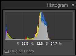
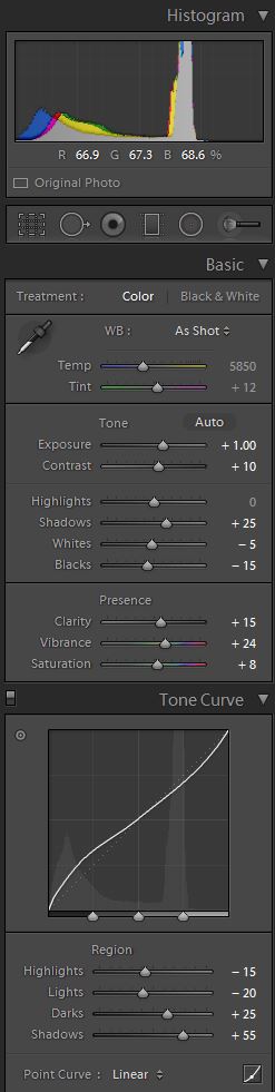
Notice it’s skewed to the dark side with a huge spike from the sky. Here are the Lightroom adjustments I made to the raw file:
I played with a lot of stuff. I made the effort to illustrate what it takes; I would not normally process this type of shot because there is no chance anything good will come from it. But, since I did make the effort for this post, I went ahead and did the other half of the processing. I’m not including those settings because they are tweaks in onOne’s Perfect Effects. Here’s the result that comes back into Lightroom.

That is not exactly what I got back from onOne . . . I did me a few more adjustments on the processed photo once it got back to Lightroom:
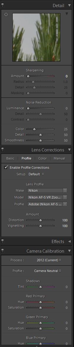
I sharpened the photo after I post-processed everything. I find it gives me a cleaner image.
After all that, the histogram is a bit more balanced.
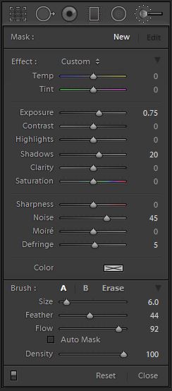
Oh, I did one more thing; I used a local adjustment to make the eye and face of the bird a little brighter. Here are the local brush settings:
Those adjustments are just for the face, carefully applied so they don’t spill over onto the surrounding sky where they would be readily visible in contrast to the rest of the sky.
This next photo was my first attempt at cropping:

I did not like the extra bits of tree standing there, at the bottom, all by their lonesome.
This next trio looks like the same photo, but it’s not; it’s the next one in the series. The original, the cropped and adjusted version, and the final product with the same processing applied.


Like I said; I would never go through all this effort for these shots because of the poor quality of the end-product.
Because new readers might be unfamiliar with my peculiar form of sarcasm and/or irony-filled banter, know I’m perfectly happy with those results. It’s just that they take more effort to achieve.
Cropping is something I do for many if not most of my photographs. There are photographers who take pride on never cropping; they compose the end product right off the bat.
I don’t have a bat, plus there’s another reason I crop. The norm when I shoot is for the focus point to be in the center. Lenses work better on center, the focusing works better on center, the metering works better on center . . . but mostly, it’s laziness. I could move the focus point, but that introduces another variable into an already complicated process.
Plus, if I move it and then forget to set it back, I screw up the next photos I take (that has happened a few times). So, center it is.

That’s the shot as taken . . . I’m gonna wanna crop that. I typically try and adhere to the Rule of Thirds (read about it HERE and HERE).
However, when I can I also try to line things up. What do I mean? In this case, it’s an imaginary line from the beak to the corner of the photo.

It’s probably not something anyone would notice. Or maybe they do. Here’s the finished product.

Notice I brought out more of the texture, both in the subject and the foreground.
By the way, I’m listening to this:
Carrying that concept a bit further, here’s another example of rules of thirds combined with flow lines and post-processing. Here’s the original.

And here’s two possible crops with the Lightroom prep before sending them to onOne.


Now, there is no rule saying lines have to lead to corners. I just prefer them so. Take note of the eyes of the bird . . .


How about that; you can see them a bit better in the final product . . . again, I lightened the eye and surrounding area to “bring them out”.
There is another concept at play here; leaving some room in the direction of motion.
Let me illustrate with this horse:

I don’t like all that stuff around the horse so I will crop down to it.

The thing is, I did not leave much room in front of it. The indicated motion will seem cramped because of it. Here’s the final product.

Not bad, but look at this next example.


Notice, I left more room in front of the horse, giving him a place to run, so to speak. I could have left a bit more, but here’s the final product.

Most people might not notice, at least not consciously.
One quick side note . . . I inadvertently processed all of the photos with a 2013 copyright notice. Some are from 2013, but not all.
How does all this work with landscape shots? Here’s a rather bland shot.

I could process it as is, but . . .

. . . I like this better.
Edited to add: I forgot to mention why this particular crop; one is the rule of thirds (the position of the cliff), but the other reason is maintaining the “S” shape of the edge of the cliff from the upper right to lower left. That’s how the original is was shot, but the grass is out of focus and I thought it distracted from the scene.
Still, not very dynamic. I could go all out and do this . . .

. . . but I’m more likely to scale it back a bit.

Sometimes the dynamic range of a scene makes it difficult to process. Here’s an original shot.

This is how I might crop this shot if I wanted a stronger center element. Those rocks in the upper right are interesting in their own right, but they draw the eye away from the main feature (the vertical ridge).

Notice, I also removed a lot of the foreground distraction on the right side and emphasized the shrubs. Here’s the result of a typical canned processing setting.

I like the strong presence of the rocks and shrubs, but the sky is all funky like. I can scale back the sky a tad, but I lose some of the impact of the rocky face.

A bit of contrast and midrange adjustment brings back the deeper tones of the rocks.

I mentioned there are different options for cropping, and I usually plan for the possibility of multiple crops. Here’s an example.
The original:

By the way, I’m listening to a rendition of the theme from Joe Versus the Volcano.
Anyway, I can crop the photo by emphasizing the foreground and removing the boring right-hand side.

There are a few things bugging me about the photo. One is that dark spot (a billboard) along the road and in the distance (it draws the eye). The other is the few pieces of garbage visible in the foreground (wrong color).
I spot-adjust to remove them, and also switch to neutral processing in preparation for onOne processing.

And here’s the final product.

Or, is it?
The other crop I could have done, again removing the offending dark spot.

And here’s this final product.

Some people like sky . . . others like the texture in the foreground. The choice is yours.
Me? In this case, I prefer the one with the foreground (the first crop).
I usually plan for crops. Here are a few examples of original photos and subsequent crops.


Here’s one where the lighting was very bad due to a very overcast sky).


. . . and the final product . . .

I could have shot at a higher ISO, but that would have blown out what little definition of the sky presented itself. It’s easier to recover underexposed features (especially if shooting RAW) as opposed to details in areas that are blown out (over-exposed).
Brightening or increasing the exposure on something might introduce grain, but you can deal with that. When something is blown out, there is little one can do, and whatever you do will usually result in stuff not quite looking right.
One other comment . . . even with the guidelines switched on, I often shoot “slanted”. I mean, not if I’m paying attention, but if I’m engrossed in the scene I end up with photos that sag on the right. Anything with vertical or horizontal lines, such as a horizon, will immediately look wrong. Even when I don’t crop I often have to straighten the photos.
Proceeding, here’s another example. The original:

. . . let me do my crop thing . . .

That’s not bad; the clouds still look ‘natural’. Here’s the finished product.

Now, I mention there are other cropping possibilities . . . here’s another crop from the same photo.

. . . and here’s the final product.

I pushed the processing on this to show what can happen to the clouds; I don’t think they look as good as they did in the first crop. This was on purpose, but sometimes your processing requires a lot of tweaking to keep everything ‘looking natural’.
Before I push for the finish, here’s what I’m listening to now:
OK, I’ve been speaking about cropping and post-processing. Understand that cropping comes into play because we capture rectangular frames and those might not always lend themselves to what we want to capture . . .
. . . but, there are times when they do. Oh, happy days! All I then have to do is use my canned processing. Here are examples of original and post-processed photos, no cropping required.


That’s it. This post has ended . . . except for the stuff below.
~ ~ ~ ~ ~ ~ o o o o o o ~ ~ ~ ~ ~ ~

Astute persons might have noticed these doodles, and correctly surmised they hold some significance for me, and perhaps for humanity at large.
If you click on the doodle, and nothing happens, this is the link it’s supposed to go to: https://disperser.wordpress.com/2011/12/26/palm-vx-and-i/.
<><><><><><><><o><><><><><><><><><o><><><><><><><>
Note: if you are not reading this blog post at Disperser.Wordpress.com, know that it has been copied without permission, and likely is being used by someone with nefarious intention, like attracting you to a malware-infested website. Could be they also torture small mammals.
<><><><><><><><o><><><><><><><><><o><><><><><><><>
Please, if you are considering bestowing me recognition beyond commenting below, refrain from doing so. I will decline blogger-to-blogger awards. I appreciate the intent behind it, but I prefer a comment thanking me for turning you away from a life of crime, religion, or making you a better person in some other way. That would mean something to me.
If you wish to know more, please read below.
About awards: Blogger Awards
About “likes”: Of “Likes”, Subscriptions, and Stuff
Note: to those who may click on “like”, or rate the post; if you do not hear from me, know that I am sincerely appreciative, and I thank you for noticing what I do.
. . . my FP ward . . . chieken shit.

Well done, and Thanks. Post processing has dramatically improved what we can achieve with our cameras, as your examples readily attest. For me (and you, I’m sure,) It’s personally rewarding … and a lot of fun. We can individually “create” and mold the images to what we believe they should be, perhaps as seen in our mind, or as a more “artistic” rendering.
Also, what it has done for pre-digital, film photos is akin to discovering a personal treasure trove. From old pictures never being particularly interesting… to resurected awesomeness! M 🙂
LikeLike
Thank you. I should have included some examples of what can be done in Photoshop (hint: more), but that not only takes more time, but it’s not practical for the flood of photos I usually post. All of the above adjustments, with the exception of the eye thing, are just moving around sliders.
The advantage is that once one photo in the series is processed, the same processing can quickly be applied to the rest.
And yes, for some of these I purposefully went back a few years to photos I had not bothered to process to show you can salvage many photographs one would once scrap.
LikeLiked by 1 person
Very interesting post on a subject near and dear to me. Sometimes I feel cropping is the least understood adjustment to a photo. As you mentioned, some folks are afraid to crop or have the idea that they compose in camera and that’s that. The”purity”of photography (as I read recently on another blog). That’s fine if your uncropped shot is exactly the way you want it. But I see photos everyday that could benefit from some cropping and, in some cases, a lot of cropping. Not only can a thoughtful crop improve a composition, but sometimes there may be a separate picture within a picture the photographer may have been unaware of when it was shot. I realize that there are many cameras with very small sensors and some may not allow cropping of a severe amount. But it may be better to give up a high percentage enlargement for a better overall composition. It’s too bad nobody has invented a way to recycle those wasted pixels.
LikeLike
Well, they were free. In keeping with society’s current thinking, no need to recycle them.
I fully expected someone to mention I messed up the purity of the photo by removing the billboard and the refuse on the ground.
My general rule is to maintain the so-called purity, but anything that does not belong is fair game, and I’m pretty sure neither the billboard nor the garbage was part of the “natural” landscape.
Of course, if I wanted to highlight how man-made stuff intrudes into the scene, I would have left them in there.
One thing I did not mention but should have is that my current habit when I snap a photo is to leave more room around the subject than what I think I need. That’s specifically because so often in post-processing I see a better composition than what I saw in person. Sometimes I even catch stuff I decide to leave in as working well with the subject.
The reason I do it is because when we concentrate on the subject we tend to miss what’s around it (that can also mess up a photo).
And yes, I know you know this, but perhaps some reader might get something from it.
LikeLike
This was a really interesting read. Thanks for that. I’m not up on all the pp, I tend to do real basics rather than messing with sliders. But there again I just haven’t the time to spend or the money to spend on software.
I liked the kestrel series, that was a really interesting progression. You took a mediocre photo of not very much and really improved it’s appearance.
As I use photos to illustrate my words rather than vice versa, it’s pointless messing with them. They are merely there for graphic design, to break up the text. Anyway this comment is not about photoblogs.
I do like good cropping about which I am marginally more knowledgeable, as good cropping was part of sub-editing training. Impact for a news or magazine photo isn’t the same as composition etc. Depends what one is trying to achieve. Good post though with some thoughtful examples. But I won’t go through each one, you’ll be pleased to hear 🙂
LikeLike
Thank you, and it’s enough being recognized as thoughtful . . . a rare occurrence, I’ll have you know.
LikeLike
Ansel Adams is turning in his grave. The manipulation of pixels is nothing short of chromatic heresy.
Having vented, I would add that I really really dig your pics.
LikeLike
Don’t know if you are being ironic or not . . . Ansel Adams heavily manipulated his photos, doing in the developing process what we now do on the computer.
Almost nothing you see in still or moving pictures is as captured. Manipulating the visual mediums is how the story is told.
http://www.naturephotographers.net/articles0703/mg0703-1.html
Seriously, think of it as writing a story. Take all the words you want to use, and spill them on a page. Without arranging them, you cannot have pictures appear in a reader’s mind.
Think of it as the comparison between reading a dictionary and a novel. Same words, different result.
LikeLike
Great post for me. The post processing looks magic to me and I enjoyed finding out what is possible. I’m not quite ready to go to the next step as I fear it will involve a long training period. I was also unable to find out on the net how much a stand alone onOne software is. You can have a free download trial but I hate the marketing idea of having to do that to find out the cost. It puts me off and I am penalised for being stubborn. Amelia
LikeLike
The product is completely stand-alone, but works better with Lightroom. If money is an issue, you can’t go wrong with Lightroom for all your editing needs.
That’s all I did for many years, and it’s only now that I batch process that I make more use of the onOne, DxO, and Topaz suites.
For that matter, DxO may also be a good choice.
As for money:
onOne suite – the premium edition is around $180 street price
DxO Pro Elite – around $150
Topaz Suite – when it’s on sale it’s something around $250, but it has the advantage of free lifetime upgrades.
Lightroom – the latest Lightroom is $150, however, Adobe has a monthle fee license that includes both photoshop and Lightroom for $10/month.
LikeLike
http://www.on1.com/support/1806/
LikeLike
Just being a gadfly. There is a debate to be had about fraud-tography (copyright pending on that word), but I’m not the one to engage. I make a livin’ off computer-generated imagery. I got no dog in the fight – just wanted point out that there are two dogs.
LikeLike
Not the same dogfight; there are legitimate concerns about photojournalism where the cropping and editing of a photo can significantly alter the presentation and intent of the original scene.
The above is more about art than messages. Can it be used to mislead? Yes, but that’s the same with every medium. Photoshop has gotten good enough that someone can fabricate an image out of whole cloth of places, things, and people that never existed and never will . . . but they still draw on the familiar things of human experience.
In that regard, the practice is also like what authors do. As fiction writers, we create characters and worlds that serve as lenses for looking at the human experience. When I crop a scene in some sense I want not only to highlight what I liked about it but also point out to people what is around them.
I don’t have aspirations toward teaching people how to “see” – or, if I do, it’s more with my writing than with photos – but I might want them to be aware of what they could see if they took the time. And, of course, for them who don’t have the opportunity or time, I show them so they don’t miss it as much.
. . . there a whole bunch who don’t care either way, but then they don’t read these kinds of blogs.
LikeLike
Being a not-a-photographer, I still found this interesting. And I’m sure you helped those who are photographers.
Comparing the photos was fun and I could see the differences your fiddlin’ made! (Sorry, for using such technical terms like “fiddlin'”! 😉 😛 )
Great music, as always! Who was playing the piano?! (Just someone who posted to youtube?!)
HUGS!!! Hope your weekend is going well! 🙂
LikeLike
Yes; whatever information is on the video is all I know. I just happen to like that rendition of the music from the movie which, by the way, we watched for the (?) time on Friday evening.
If you have not watched Joe vs. the Volcano . . . well, you should.
LikeLiked by 1 person
I have! It’s one of my fav Tom Hanks movies! I should check out the movie soundtrack though!
HUGS!!! Happy Monday!!! 🙂
LikeLike
I waited a number of years before it was available on CD.
Here’s something to keep you going until you get it:
Joe Versus The Volcano: http://www.youtube.com/playlist?list=PLpUIcDaPXtl2j7Vz_pclA5vg9zzTsAYjW
LikeLiked by 1 person
Thank you, Emilio! 🙂
LikeLike
I didn’t understand the Ansel Adams reference above, since Ansel did MORE post-processing than almost any photographer in history. He would applaud you. In fact, I’m finding that photographers (like Henri Cartier-Bresson) who poo-pooed post processing invariably did so because they were too lazy to spend time in a darkroom. It’s all part of the art. I must admit, I never took the time to figure out the curves and the histogram on most programs; I just tend to do it intuitively. But creating a (relatively?) repeatable process seems pretty smart.
“Because new readers might be unfamiliar with my peculiar form of sarcasm and/or irony-filled banter, know I’m perfectly happy with those results. It’s just that they take more effort to achieve.”
I’m glad you wrote that, since I was puzzled as to why you didn’t like your work. The feathers in the kestrel really popped in the finished photo. Given I just saw some crappy shots for sale in Target at $20 a pop, I’m suddenly becoming inspired to make my street shots more purty. Retirement money is a good thing.
LikeLike
He’s a friend, and that friendship, like all my friendships, comes part and parcel with appropriate banter. The only reason I corrected Perry was in the unlikely event he was not aware of Ansel’s history.
Retirement money is a good thing . . . but I would not hold out too much hope of making it from photography. However, if you have some in or other opportunities I’m not aware of, yes . . . purty sells a tad better than crappy.
As for the adjustments, I’m not a student of the art of adjustments but through a lot of trial and error I’ve worked out different combinations of adjustments that work for different types of photos. I included the histogram because many online help articles mention it, but I don’t really pay attention to it.
That said, given the available tools out there (many free), I don’t understand why more people don’t take the time to present the best photo they can. Perhaps their tastes and mine don’t coincide. I mentioned “dark” photos, and I’m seeing more and more of them; perhaps a trend in the making . . . perhaps reflecting mankind’s future.
LikeLike
I was sort of joshing about the retirement money. I’ve been saving my whole life. Still, it would be nice to see something hanging up somewhere cleaner than my bathroom.
LikeLike
. . . you could just clean the bathroom . . .
LikeLike